
15, 30, 45, and 60 second commercial structures: a production guide
A practical guide to building 15, 30, 45, and 60 second commercial structures around attention, product proof, emotional movement, brand recall, and format-specific editing.
A practical guide to building 15, 30, 45, and 60 second commercial structures around attention, product proof, emotional movement, brand recall, and format-specific editing.
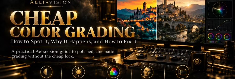
Cheap color grading usually comes from uncontrolled contrast, color casts, clipped highlights, and effects without a visual reason. Learn how to diagnose and fix the problems in footage, stills, and AI-generated images.

A practical library of reusable prompt templates for planning and generating cinematic images, video, characters, environments, camera language, lighting, sound, music, motion, and continuity.

A practical guide to turning beautiful but vague storyboard frames into clear production planning panels that explain shots, movement, timing, and continuity.

A practical guide to fixing floating objects in AI filmmaking, from broken contact shadows and missing weight to sliding props, unstable surfaces, bad tracking, and postproduction repairs.
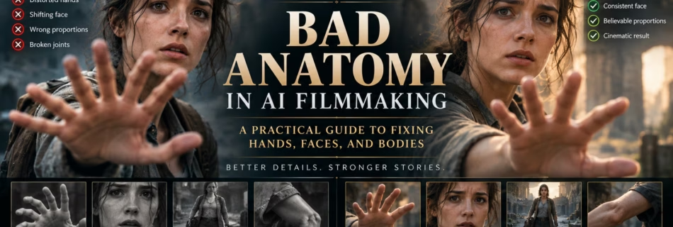
Learn why AI generated characters develop extra fingers, broken joints, shifting faces, and impossible body proportions, then fix those anatomy errors with better prompts, references, shot design, and post production.
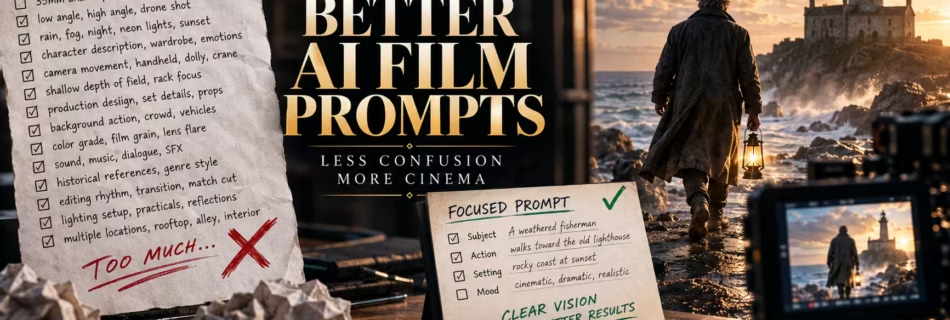
Over-detailed prompts can give an AI video model too many competing instructions. Learn how to simplify overloaded film prompts without losing the shot, mood, or story.
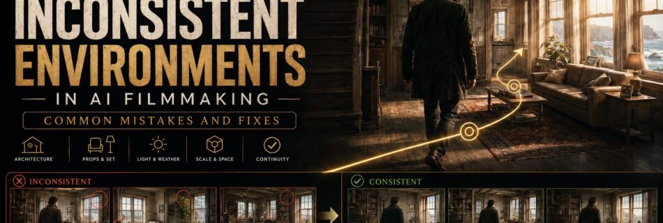
Learn why AI generated film locations change between shots and how to fix architecture, props, lighting, weather, geography, scale, and continuity problems.
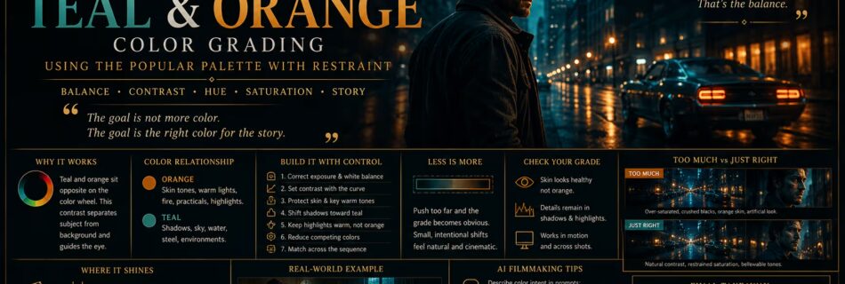
Teal and orange is one of the most recognizable color relationships in modern film and advertising. Cool blue-green tones often occupy the shadows, sky, or environment, while warm orange remains in skin, practical lights, and selected highlights. The contrast helps a subject separate from the world around them. The palette works because it follows relationships …
Read more “Teal and Orange Color Grading: Using the Popular Palette With Restraint”
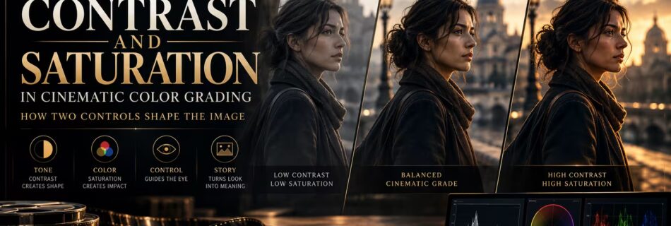
Contrast and saturation are two of the first controls most people reach for when grading. They are also two of the easiest to misuse. Contrast changes the relationship between dark and bright parts of an image. Saturation changes the strength of color. Together, they influence whether a frame feels soft or severe, restrained or loud, …
Read more “Contrast and Saturation in Cinematic Color Grading: How Two Controls Shape the Image”