Teal and Orange Color Grading

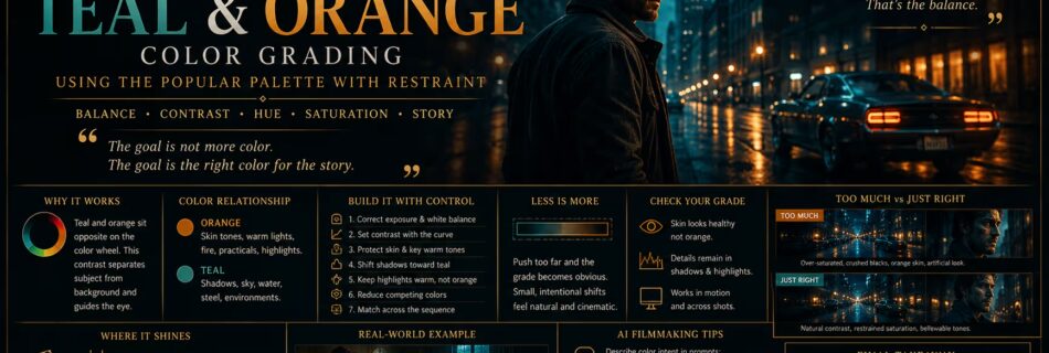
Teal and Orange Color Grading: Using the Popular Palette With Restraint

Teal and orange is one of the most recognizable color relationships in modern film and advertising. Cool blue-green tones often occupy the shadows, sky, or environment, while warm orange remains in skin, practical lights, and selected highlights. The contrast helps a subject separate from the world around them. The palette works because it follows relationships …

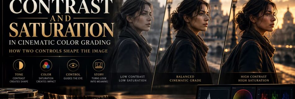
Contrast and Saturation in Cinematic Color Grading

Contrast and Saturation in Cinematic Color Grading: How Two Controls Shape the Image

Contrast and saturation are two of the first controls most people reach for when grading. They are also two of the easiest to misuse. Contrast changes the relationship between dark and bright parts of an image. Saturation changes the strength of color. Together, they influence whether a frame feels soft or severe, restrained or loud, …

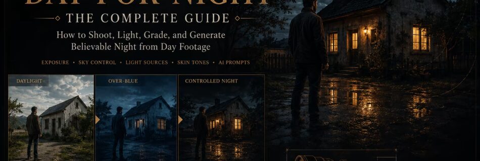
day for night grading

Day-for-Night Color Grading: Creating a Believable Night Scene From Daylight Footage

Day-for-night is the process of making footage shot in daylight appear to take place at night. It can be done through careful planning on set, through color grading, through exposure and lighting choices, or through a combination of all three. The technique is more demanding than simply turning the image blue and dark. A convincing …