The story in brief
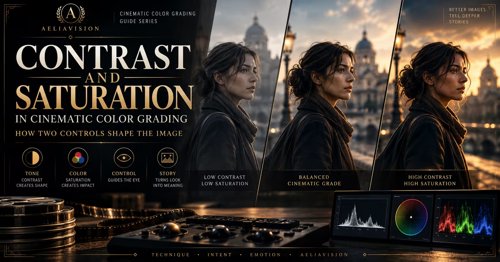
Contrast and saturation are two of the first controls most people reach for when grading. They are also two of the easiest to misuse.
Inside this story
Contrast and saturation are two of the first controls most people reach for when grading. They are also two of the easiest to misuse.
Contrast changes the relationship between dark and bright parts of an image. Saturation changes the strength of color. Together, they influence whether a frame feels soft or severe, restrained or loud, natural or artificial, intimate or distant.
The controls are simple. The judgment is not.
A cinematic grade rarely comes from pushing both sliders until the image looks dramatic. It usually comes from deciding where the image should hold detail, which colors deserve attention, and what the audience should feel when the shot cuts into the sequence. A low-contrast image can be tense. A highly saturated image can be quiet. The setting alone does not determine the emotion. The relationship between the controls and the story does.
This guide explains how contrast and saturation work, how to use them in real footage and AI-generated images, how to match them across shots, and how to avoid the familiar problems that make generated footage look cheap or over-processed.
What contrast controls
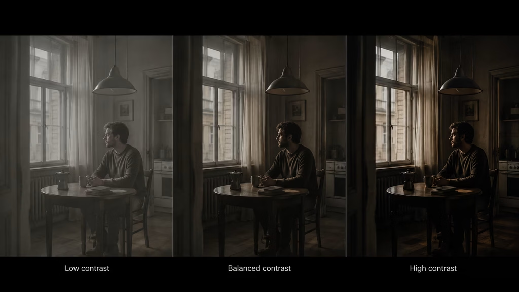
Contrast describes the difference between the darker and brighter values in an image. A high-contrast frame has a larger separation between shadows, midtones, and highlights. A low-contrast frame keeps those values closer together.
When you increase contrast, shadows usually become darker and highlights become brighter. The image gains separation and apparent punch. Edges may feel clearer because adjacent areas have more difference in value.
When you reduce contrast, shadows lift and highlights move closer to the middle. The image becomes softer and flatter. That can suggest haze, memory, gentleness, overcast light, or a deliberately restrained visual world.
Contrast is not the same as brightness. Brightness moves the whole image up or down. Contrast changes the distance between values. A dark image can still have high contrast if it contains deep blacks and bright highlights. A bright image can have low contrast if most of its values stay close together.
This distinction matters during correction. If the whole image is too dark, raise exposure before increasing contrast. If the image is dull because the values are too close, adjust contrast or the tone curve. Raising contrast on an underexposed image may crush the shadows without fixing the overall level.
The contrast curve matters more than the contrast slider
A single contrast slider applies a broad change. A tone curve gives you more control over where that change happens.
The lower part of the curve controls shadows. The middle controls midtones. The upper part controls highlights. A gentle S-curve usually deepens shadows and lifts highlights, creating more separation. A lifted black point keeps the darkest values above pure black, producing a faded or washed look. A compressed highlight section protects bright areas and creates a softer roll-off.
Different curves produce different feelings even when the overall contrast appears similar.
A steep curve in the midtones can make faces and objects feel more graphic. A gentle curve keeps transitions smooth. A curve that lifts shadows but keeps highlights controlled can suggest older film, fog, or a low-density image. A curve that deepens shadows while protecting highlights can create a clean, tense look.
Use the curve with the lighting in mind. If the shot already contains hard sunlight and dark shadows, adding more contrast may remove useful information. If the light is flat and the scene needs shape, a modest S-curve may help.
In AI-generated images, contrast can also be part of the prompt. Phrases such as “soft tonal range,” “moderate contrast,” “deep but detailed shadows,” and “controlled highlights” give the model more useful direction than simply writing “cinematic.”
Low contrast and when it works
Low contrast keeps the image’s values close together. It does not have to look dull. The frame can still use composition, color separation, focus, and movement to direct attention.
Low contrast works well for:
- Overcast exteriors
- Quiet drama
- Memory or dream sequences
- Soft daylight interiors
- Documentary realism
- Period images with faded texture
- Scenes where faces should feel gentle rather than carved by hard light
A low-contrast grade can also make a scene feel less certain. When shadows contain more information, the audience may search the frame for details. The image does not announce where the danger is. It leaves more of the environment available.
The risk is losing hierarchy. If the subject, background, and important object all sit at the same value, the viewer may not know where to look. Use color, framing, focus, or blocking to compensate.
A low-contrast image also needs enough separation to survive compression and small screens. A frame that looks delicate in a grading suite may become gray and indistinct on a phone. Check the image at normal viewing size.
High contrast and when it works
High contrast creates a wider distance between dark and bright values. It can make the frame feel hard, tense, graphic, or severe.
High contrast works well for:
- Noir and crime stories
- Night interiors with motivated practicals
- Thrillers and action sequences
- Graphic commercial work
- Silhouettes and backlit subjects
- Scenes with strong moral or emotional division
High contrast does not mean that every shadow should become black. A useful high-contrast grade can keep detail in the shadows while separating them clearly from the midtones. If all the shadow information disappears, the audience loses faces, locations, and actions.
The same applies to highlights. A bright practical or window may clip intentionally, but if every bright surface turns white, the image becomes harsh without becoming meaningful.
High contrast looks strongest when the lighting supports it. A hard key, a bright window, a dark background, or a single practical gives the grade something to shape. If the source is evenly lit, an aggressive contrast curve may look artificial.
Contrast and skin tones
Faces need special care when contrast changes. A stronger curve can deepen eye sockets, make cheek shadows heavy, and remove detail from dark skin tones. A lifted curve can reduce facial shape and make the image feel washed out.
Check the face at normal size. Then inspect the eyes, nose, mouth, and the transition between the face and the background. The goal is not to make every face bright. The goal is to keep the expression readable and consistent with the scene.
Skin should remain believable even when the world around it is stylized. A blue or green environment can work if the face has enough separation and the skin color remains controlled. Contrast and saturation adjustments should not turn skin into a solid orange patch or erase its natural variation.
A skin qualifier can protect the face while the rest of the image becomes more graphic. Use a soft mask and check the edges. A hard mask can create an obvious halo around the subject.
What saturation controls
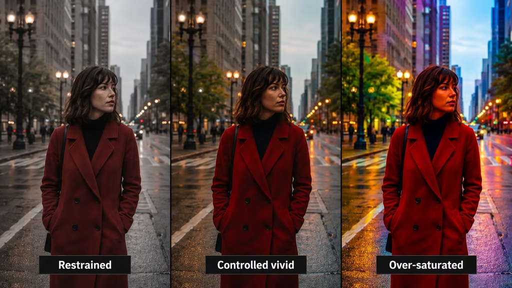
Saturation describes the strength or intensity of a color. Higher saturation makes colors more vivid. Lower saturation pulls colors toward gray.
Saturation is not the same as brightness. A dark red and a bright red can have similar saturation but different luminance. Saturation is also not the same as hue. Hue identifies the color family, while saturation describes how far that color sits from neutral.
A saturated blue has a strong color presence. A desaturated blue may appear gray, steel, or pale. A change in saturation can alter the apparent temperature and mood of a scene without changing the hue itself.
Global saturation changes every color. That can be useful for establishing a broad direction, but it can also damage skin, foliage, practical lights, and product colors at the same time. Once the general level is close, selective adjustments are often safer.
Low saturation and restraint
Lower saturation can make an image feel serious, natural, aged, quiet, or physically harsh. It can also make a bright location feel drained or emotionally distant.
Desaturation works well for:
- War and thriller scenes
- Documentary realism
- Somber drama
- Period images
- Dusty landscapes
- Industrial interiors
- Scenes in which one accent color needs to matter
The popular idea that cinematic images must be desaturated is too narrow. Many films use strong color. What matters is control. A restrained image may still contain a vivid red coat, a warm practical lamp, or a blue sky. The surrounding colors are simply quieter so the accent has room.
Too much desaturation removes life from skin and materials. Hair, fabric, food, foliage, and painted surfaces can all become gray when the grade goes too far. The result may feel expensive in a still frame but dead in a sequence.
Use the eye as a reference. If the subject looks ill without a story reason, restore some color or correct the hue before adding a creative treatment.
High saturation and its risks
High saturation can support fantasy, comedy, music videos, advertising, colorful production design, and heightened reality. It can make a frame feel energetic and immediate.
The problem is uncontrolled saturation. When every color is vivid, nothing has priority. Red, green, blue, orange, and purple all compete for attention. This is sometimes called the AI rainbow look because generated images often arrive with intense, unrelated colors that feel attractive at first and exhausting after several shots.
High saturation also makes errors more obvious. A skin-tone shift becomes louder. Green foliage may look fluorescent. A blue shadow may become electric. A product can change from believable material to plastic surface.
If you want a vivid image, choose the colors that should carry the energy. Reduce competing hues. A red subject against blue and gray surroundings is easier to read than a red subject surrounded by equally strong green, yellow, and purple.
Contrast and saturation together
Contrast and saturation interact. Increasing contrast can make colors appear stronger because bright and dark areas separate. Increasing saturation can make contrast feel more aggressive because colored regions become more distinct.
A high-contrast, high-saturation grade is loud. It can work for a commercial or a heightened action sequence, but it will quickly feel excessive if used across a quiet drama.
A low-contrast, low-saturation grade is restrained and soft. It can suggest distance, sadness, memory, or realism, but it may need stronger composition to avoid becoming flat.
High contrast with low saturation can create a gritty, severe look. This combination often supports war, crime, and industrial subjects. Low contrast with higher saturation can create a soft colorful world, useful for fantasy, romance, or a stylized commercial.
You can think of the two controls as separate axes rather than one “cinematic” slider:
| Contrast | Saturation | Possible feeling | |—|—|—| | Low | Low | Quiet, faded, distant | | Low | High | Soft, colorful, playful | | High | Low | Gritty, severe, restrained | | High | High | Loud, graphic, heightened | | Moderate | Moderate | Flexible natural baseline |
These are starting points, not fixed genre rules. Lighting, hue, composition, and editing can change the reading.
Choosing a baseline
Before building a look, create a neutral or restrained baseline. This gives you something to compare against and keeps the grade from drifting while you experiment.
A useful baseline usually has:
- Readable shadows
- Controlled highlights
- Natural or intentionally motivated white balance
- Believable skin tone
- Moderate contrast
- Saturation that matches the source and genre
- No unnecessary texture or glow
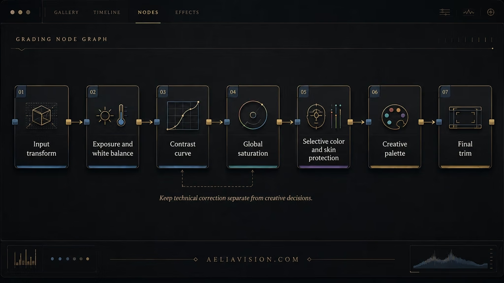
Save this version. In DaVinci Resolve, keep the correction nodes separate from the creative nodes. In an AI workflow, preserve the original generated frame and a corrected reference frame.
The baseline is not the final grade. It is a stable checkpoint. If a creative treatment becomes too strong, you can return to it and rebuild with better information.
Selective saturation
Global saturation is useful at the beginning, but selective saturation gives you more control.
You can reduce the saturation of a background hue while leaving the subject intact. You can protect skin while lowering the intensity of a green wall. You can increase the saturation of one prop that carries story information. You can reduce the saturation of shadows so dark areas do not become colorful noise.
Use qualifiers, curves, and masks gently. A selection that is too narrow may break when the subject moves or the light changes. A selection that is too broad may affect colors you wanted to keep.
Check the result in motion. A still mask can look perfect and then flicker around hair, hands, or moving clothing. If the adjustment is difficult to track, soften it or use a broader, less aggressive correction.
Contrast and luminance
Saturation behaves differently at different luminance levels. Highly saturated shadows can look dirty or crushed. Bright saturated highlights can look artificial or clip quickly.
Many grades keep shadow saturation lower while allowing midtones to carry the main color. This protects the darker parts of the image and keeps skin or production design colors from becoming too loud.
A luminance-versus-saturation curve can help. Reduce saturation in the deepest shadows, keep the midtones controlled, and watch highlights for clipping. The exact curve depends on the footage and the intended look.
This is especially useful for AI footage, where shadows may contain unusual color noise. Reducing that noise can make the image feel more photographic without flattening the entire frame.
Matching contrast across shots
A sequence feels inconsistent when one shot has soft gray shadows and the next has crushed blacks, even if the palette is similar. Match contrast before chasing creative color.
Compare the brightest skin highlight, the darkest useful shadow, and a neutral object that appears in more than one shot. A waveform helps you see whether the basic ranges are close. Then watch the cut at normal speed.
Do not force every shot to have identical values. A backlit exterior and a night interior naturally have different ranges. The goal is to make the difference feel intentional rather than accidental.
A character walking from outside into a room may pass through a real contrast change. Preserve it if the scene supports it. If the cut is supposed to feel continuous, soften the difference through correction or lighting adjustments.
Matching saturation across shots
Saturation mismatch is easy to notice in skin, foliage, wardrobe, and practical lights. One shot may feel colorful while the next looks gray. The problem becomes stronger when the same character or object appears in both shots.
Use a reference still for the scene. Compare colors by relationship, not only by the global saturation number. A warm lamp may need to remain strong while the blue window light is reduced. A red jacket may be the scene’s intended accent.
If the source shots were generated separately, they may have different color distributions. Correct each shot first. Then build a shared creative grade. Applying the same saturation adjustment to mismatched sources rarely produces a match.
Contrast and saturation for AI-generated images
AI image models often respond to contrast and saturation language, but the terms are not exact controls. The model may interpret “high contrast” through lighting, composition, or color separation. It may interpret “desaturated” by removing color from the entire image, including skin.
Use descriptive language alongside the control term:
“Moderate contrast with detailed shadows, controlled highlights, restrained saturation, natural skin tones, one muted red accent.”
For a stronger look:
“High contrast but preserve shadow detail, deep textured blacks, warm skin, subdued background colors, vivid red practical light as the only strong accent.”
For a soft look:
“Low contrast, gentle tonal transitions, slightly desaturated colors, soft daylight, no clipped highlights, calm documentary mood.”
The prompt should say what to protect. “High contrast” without “preserve shadow detail” can lead to crushed faces and black backgrounds.
Contrast and saturation in AI video
Image-to-video models may change contrast and saturation during motion. A practical light can grow brighter, a face can turn warmer, or the background can become more colorful as the clip develops.
Use a stable reference frame and describe the look as a continuity requirement:
“Preserve the reference frame’s moderate contrast and restrained saturation throughout the shot. Keep skin tone stable, keep the red sign as the only strong accent, and do not shift the scene toward neon colors.”
The result may still drift. Correct the clip in post and compare several frames, not only the first frame. If the model cannot hold the look, reduce the complexity of the motion or use shorter clips.
Contrast and saturation by genre
Drama
Drama often benefits from a moderate or restrained baseline. Faces need detail, and the environment should support the performance. Contrast can increase when the relationship becomes tense, while saturation may narrow to a small emotional palette.
Thriller
Thrillers often use controlled contrast and reduced saturation. Deep shadows can hide information, but important faces and clues should remain visible. A single color accent can mark danger or attention.
Horror
Horror may use low saturation, sickly color, or strong contrast. The treatment depends on whether the fear comes from a realistic environment or a distorted world. Do not make every horror frame equally extreme. A normal-looking shot can make a later shift feel more disturbing.
Fantasy
Fantasy can support higher saturation, especially in environments and production design. Keep a hierarchy so the frame does not become a collection of equally bright colors. Contrast can be soft for wonder or hard for danger.
Science fiction
Science fiction may use controlled cyan, magenta, steel, amber, or green. Contrast often helps separate technology from skin and organic materials. Avoid applying one neon treatment to every location.
Commercial work
Commercials use contrast and saturation to make a product readable. The product may need stronger value separation while the background stays quiet. Saturation should support the brand or object, not create inaccurate materials.
Contrast and saturation for black and white work
When saturation is removed completely, contrast becomes the main color-like control. Value separation determines whether the image feels soft, gritty, elegant, or harsh.
A black-and-white grade still needs attention to skin, highlights, and shadow detail. Different colors convert to different gray values. A red object and a green object may become similar in luminance, so the composition may lose separation.
Use contrast to clarify the frame, not to create a default crushed look. Film grain and texture can add character, but they cannot replace a useful value structure.
Film emulation and contrast
Film stocks have their own contrast behavior. Some roll highlights gently. Some hold shadow detail differently. Some produce a denser midtone structure. A film-emulation LUT or plugin may change contrast and saturation at the same time.
Treat the emulation as a starting point. Check skin, practical lights, and dark materials. Reduce the effect if it removes detail or makes the sequence inconsistent. A restrained film texture over a controlled grade often looks more believable than a heavy preset.
If you want a specific film feeling, describe the visible properties rather than relying only on a stock name:
“Moderate contrast, gentle highlight roll-off, slightly muted saturation, warm skin, subtle grain, restrained halation.”
This language remains useful across grading tools and AI image prompts.
Common mistakes
Pushing contrast to create drama
Contrast cannot create a dramatic event that is missing from the frame. It can support tension, but if the lighting, blocking, and composition are weak, deeper blacks will only make the image harder to read.
Increasing saturation to make the image cinematic
More color is not automatically more cinematic. Excess saturation often creates the generic AI look. Choose a palette and decide which colors should lead.
Using global adjustments for local problems
If one wall is too green, do not desaturate the entire image. If one face is too orange, do not reduce all warmth. Isolate the problem when possible.
Crushing shadows
Black areas can look dramatic in a still and become empty in motion. Preserve useful detail, especially around faces, hands, and objects that affect the story.
Clipping highlights
Bright whites remove texture and make practicals look like digital stickers. Let some sources clip when the story supports it, but do not lose every highlight.
Ignoring skin tone
A strong palette can still fail if faces are orange, gray, or green. Check the skin separately and compare it across shots.
Applying the same grade to every scene
A shared project look does not require identical contrast and saturation everywhere. Let locations and emotional beats change within the boundaries of the visual language.
Judging only one still
Review the grade in motion and across the cut. AI footage can shift color over time, and a single frame may hide the problem.
A practical grading workflow
Start with the source and make a copy. Keep the original available.
Set the input color space or technical transform. Confirm that the image is being displayed correctly.
Balance exposure. Preserve the detail needed for the story, especially on faces and important objects.
Correct white balance. Remove accidental casts while keeping motivated warm and cool sources.
Set a moderate contrast baseline. Use the waveform or histogram when available, then judge the image at normal size.
Set global saturation carefully. Move it only far enough to establish a usable base.
Check skin tone. Protect faces if a creative adjustment changes them too much.
Build the creative contrast curve. Decide whether the scene needs softness, density, separation, or a graphic range.
Shape saturation selectively. Quiet competing hues and protect the colors that carry story information.
Match neighboring shots. Compare the cut, not only the individual frames.
Add texture last. Grain, halation, and glow should support the final image rather than hide problems.
Review the complete sequence. Watch at normal speed and at the intended delivery size.
Save a corrected version and a final version. Keep the node tree named so the grade remains reversible.
A practical AI prompting workflow
Start with the scene and subject. Do not lead with a list of color controls.
Add the intended contrast behavior:
“Moderate contrast with readable shadows and controlled highlights.”
Add the saturation behavior:
“Restrained saturation, natural skin, muted background, one warm accent.”
Add the lighting and palette:
“Cool window light against a warm practical lamp, grounded interior colors, no neon spill.”
Add continuity constraints if the image will become video:
“Preserve contrast, saturation, skin tone, and color temperature during the camera movement.”
The full prompt might read:
“A woman waits alone in a late-night kitchen, 50mm lens, eye-level medium closeup, moderate contrast with readable shadows and controlled highlights, restrained saturation, natural skin tones, cool window light balanced by one warm practical lamp, muted blue and amber palette, background softly recognizable, preserve the color relationships during a slow push-in.”
This is more controllable than repeating “cinematic” several times.
Contrast and saturation in the AeliaVision system
Contrast and saturation should be defined in the project’s Color Palette and Lighting DNA. Record the intended baseline, the colors that may act as accents, the amount of shadow detail to preserve, and the scenes where the grade is allowed to change.
AeliaDirector shot planning can connect a color treatment to the emotional beat. A character’s isolated moment may lower background saturation and increase separation around the face. A public celebration may allow stronger color while keeping skin natural. A thriller may use deep contrast for a reveal, then return to a more neutral range after the information becomes known.
For AI workflows, save a reference frame that represents the scene’s contrast and saturation target. Use it alongside the subject, camera, environment, and lighting instructions. Correct newly generated shots toward the reference before applying the final look.
Final checklist
Before approving a grade, ask:
- Can the viewer read the important faces, objects, and actions?
- Are the darkest areas dark for a reason, or simply crushed?
- Are highlights controlled enough to preserve texture where it matters?
- Does saturation support a palette, or are all colors competing?
- Do skin tones remain believable and consistent?
- Does the shot match its neighbors in contrast and color behavior?
- Does the grade survive motion and the intended display size?
- Can you return to a corrected version if the creative look becomes too strong?
If the grade passes these checks, the controls are doing useful work.
Conclusion
Contrast and saturation shape the image’s value structure and color intensity. Contrast determines how far dark and bright areas sit apart. Saturation determines how strongly color speaks. Neither control creates meaning by itself. Meaning comes from how the adjustments support lighting, composition, performance, movement, and the sequence around the shot.
Begin with a stable correction. Set a restrained baseline. Use curves and selective adjustments instead of relying on global sliders for every problem. Protect skin tones, preserve useful shadow and highlight detail, and choose accents instead of making every color loud.
For AI-generated images and video, describe visible results as well as control names. Ask for readable shadows, controlled highlights, natural skin, muted surroundings, or a specific accent color. Then correct and match the footage in post.
A cinematic grade is rarely the strongest grade. It is the grade that tells the viewer where to look and gives every shot a place in the same film.
Related Articles
- Color Correction vs Grading Guide
- Skin Tone Guide
- Color Temperature Guide
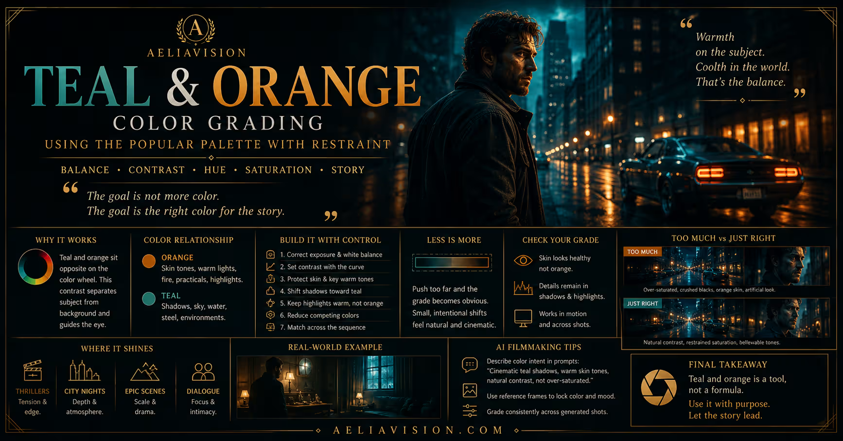
- Teal and Orange Guide
- LUTs Guide
- Node Trees Guide
- Shot Matching Guide
- Avoid the Flat Video Look Guide
- Lens Language Guide
Tools & Resources
- Contrast and Saturation Grading Checklist
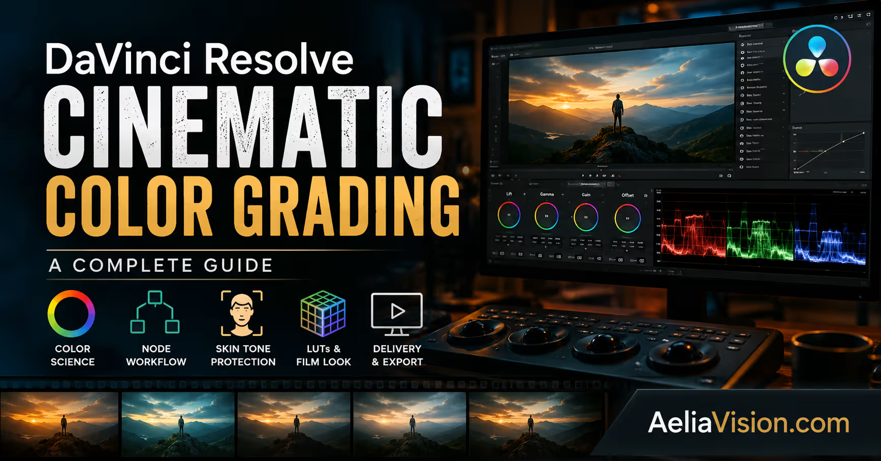
- DaVinci Resolve Node Template
- AI Footage Shot-Matching Worksheet
- AeliaVision Color Palette Planner
Continue reading
Further insights from the Journal
Have a story in mind?
Bring your next project into focus.
Tell us what you are creating and what you want the audience to feel.