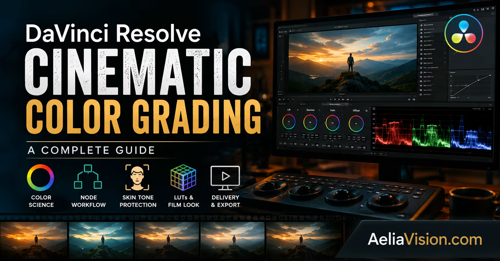
The story in brief
Learn DaVinci Resolve cinematic color grading with color management, node trees, scopes, skin-tone protection, film looks, shot matching, and delivery settings.
Inside this story
A practical guide for filmmakers and AI creators Color grading is one of the final stages where footage begins to feel like cinema. A shot can be beautifully composed, sharply focused, and properly exposed, but without thoughtful color work, it may still feel unfinished. In filmmaking, color guides emotion, controls attention, unifies scenes, and gives a film its visual identity.
DaVinci Resolve has become one of the most respected tools for cinematic color grading because it gives filmmakers deep control over exposure, contrast, color balance, skin tone, film texture, LUTs, HDR workflows, and final delivery. For editors, YouTubers, commercial creators, AI filmmakers, and independent directors, learning Resolve’s color workflow is one of the fastest ways to make footage feel more intentional and more professional.
This guide explains cinematic color grading in DaVinci Resolve from the ground up. It covers correction versus grading, color science, color management, node structure, film-look techniques, LUTs, skin-tone protection, scopes, shot matching, and export settings within a complete film pipeline.
What is cinematic color grading?
Table of contents
Cinematic color grading is the process of shaping the final mood, contrast, color palette, and visual personality of an image. It can make a scene feel warm and nostalgic, cold and lonely, gritty and realistic, soft and romantic, dark and suspenseful, or futuristic and polished. The key word is intention.
Many beginners think cinematic grading means adding a LUT, pushing shadows toward teal, warming the highlights, and adding black bars. That approach can sometimes create a stylish frame, but it often leads to a generic image. True cinematic grading begins with technical control: exposure, white balance, contrast, color management, shot matching, and skin tone protection. Only after that foundation is built should the creative look be added.
A professional grade should answer several creative questions. What is the emotional tone of the scene? Where should the viewer look first? Should the image feel clean, gritty, soft, harsh, natural, stylized, modern, vintage, commercial, or dramatic? Are the skin tones believable? Does the grade support the story, or is it calling attention to itself?
The best color grading does not simply make footage look “cool.” It makes the image feel right for the scene.
Color correction vs. color grading
Color correction and color grading are often used as if they mean the same thing, but they are two different stages of the finishing process.
Color correction is the technical stage. Its purpose is to make the footage balanced, consistent, and natural before any creative style is applied. This includes fixing exposure, white balance, contrast, saturation, black levels, white levels, color casts, and shot-to-shot inconsistencies. If one shot is too green, another is too dark, and another has crushed shadows, those issues should be corrected before the creative look is added.
Color grading is the creative stage. Its purpose is to shape mood, atmosphere, genre, and visual identity. This is where the colorist builds the film look, pushes the palette toward a specific emotional direction, adds warm highlights or cool shadows, creates a vintage tone, builds a modern digital cinema look, or emulates the feeling of film stock.
A simple way to understand the difference is this:
| Stage | Main Purpose | Typical Adjustments | Creative Goal |
|---|---|---|---|
| Color Correction | Make the image technically balanced | Exposure, white balance, contrast, saturation, shot matching | Create a clean, usable baseline |
| Color Grading | Make the image emotionally expressive | Palette shaping, film look, stylized contrast, LUTs, texture | Support mood, story, and genre |
Correction makes the image technically right. Grading makes the image emotionally right. If you skip correction and jump directly into heavy grading, your image may look interesting for one shot but fall apart across a full scene.
Understanding color science before grading
Color science can seem intimidating, but every serious colorist needs to understand the basics. When you grade in DaVinci Resolve, you are not simply changing colors by eye. You are working inside specific color spaces, transfer functions, gamma curves, camera profiles, and display standards.
Without color management, the same footage can appear different depending on how Resolve interprets it. A log image may look flat, a Rec.709 file may look too contrasty, HDR footage may appear washed out, and AI-generated material may lack a clear camera color profile. Understanding color science helps you avoid guessing and gives you a predictable foundation for creative work.
Color space and gamut
A color space defines the range of colors an image can contain. Common examples include Rec.709, DCI-P3, Rec.2020, DaVinci Wide Gamut, and ACES.
Rec.709 is the standard color space for most SDR web, television, and online video. It is reliable, widely supported, and safe for general delivery, but it has a smaller color range than cinema and HDR spaces.
DCI-P3 is commonly used for digital cinema projection. It can represent a wider range of colors than Rec.709, especially in reds and greens, making it useful for theatrical delivery.
Rec.2020 is used in many HDR workflows and supports a much wider color range than both Rec.709 and DCI-P3.
DaVinci Wide Gamut is Resolve’s wide working color space. It is designed to preserve more image information during grading, especially when working with log footage, RAW footage, or multiple camera formats.
ACES, or the Academy Color Encoding System, is a professional color management framework designed to maintain consistent color across cameras, VFX, grading, and delivery.
The larger the color space, the more room you have to preserve saturated colors, highlight detail, and subtle tonal information. However, wider color spaces also require proper color management. If they are handled incorrectly, colors can shift, clip, or look unnatural.
Gamma, log, and dynamic range
Gamma describes how brightness values are encoded and displayed. Standard Rec.709 footage uses a display-referred gamma curve, while most cinema cameras record in log formats such as ARRI LogC, Sony S-Log3, Canon Log, RED Log3G10, or Blackmagic Film.
Log footage looks flat and low contrast at first, but that flatness is intentional. Log encoding preserves more dynamic range, which gives the colorist more flexibility to recover highlights, lift shadows, and build contrast in a controlled way. The flat image is not the final look. It is a container for image information.
Before log footage looks normal, it needs to be transformed into a display space such as Rec.709 or managed through a proper color-managed workflow.
Color management in DaVinci Resolve
Color management tells Resolve how to interpret your footage and how to convert it for your final display. Without color management, you are making assumptions about how the footage should look. With proper color management, you create a predictable pipeline from input to output.
DaVinci Resolve gives you three common approaches: manual color management, DaVinci YRGB Color Managed, and ACES.
Manual color management
A manual workflow means the colorist controls the transforms directly. You may work in DaVinci YRGB, apply a Color Space Transform node, use a camera conversion LUT, or manually normalize log footage.
This approach gives you maximum control, but it also places full responsibility on the colorist. If you choose the wrong input color space, wrong gamma, or wrong output transform, the image can become inaccurate very quickly.
Manual workflows are useful for simple projects, single-camera edits, Rec.709 footage, or advanced colorists who want total control over where transforms happen inside the node tree.
Davinci YRGB color managed
DaVinci YRGB Color Managed is one of the most practical workflows for modern creators. It allows you to define an input color space for your footage, a timeline working space for grading, and an output color space for delivery.
A common setup for SDR cinematic work is:
| Setting | Recommended Option |
|---|---|
| Input Color Space | Based on the camera, such as Blackmagic Film Gen 5, ARRI LogC, Sony S-Log3, Canon Log, or another camera profile |
| Timeline Color Space | DaVinci Wide Gamut Intermediate |
| Output Color Space | Rec.709 Gamma 2.4 for standard SDR delivery |
This workflow gives you a wide, flexible grading environment while safely converting the final image into the correct delivery space. It is especially useful when working with multiple cameras or AI-generated shots that need to be normalized into one consistent visual world.
For most independent filmmakers, YouTubers, commercial editors, and AI creators, DaVinci YRGB Color Managed with DaVinci Wide Gamut Intermediate is often the best balance between professional control and practical usability.
ACES workflow
ACES is a high-end color management system used in many professional film, VFX, and HDR workflows. It is designed to keep color consistent from camera capture through visual effects, grading, mastering, and delivery.
In ACES, you choose an Input Device Transform, commonly called an IDT, for the camera footage. Resolve then places the image into the ACES working environment. At the end of the pipeline, an Output Device Transform, or ODT, converts the image to Rec.709, P3, HDR, or another delivery standard.
ACES is powerful for multi-camera projects, VFX-heavy work, and strict delivery pipelines. However, it can feel different from Resolve’s standard color management. Some tools respond differently, and beginners may find it less intuitive at first.
Comparing color management workflows
| Workflow | Best For | Strengths | Weaknesses |
|---|---|---|---|
| Manual DaVinci YRGB | Simple projects, single-camera edits, advanced custom workflows | Maximum control, simple setup, no hidden transforms | Easy to make mistakes, harder to match mixed footage |
| DaVinci YRGB Color Managed | Most modern creators, multi-camera projects, AI film pipelines | Flexible, professional, easier normalization, strong SDR/HDR support | Requires correct input settings |
| ACES | Feature films, VFX pipelines, strict delivery environments | Strong consistency across cameras, VFX, and delivery | More complex, tool behavior can feel different |
A practical node tree for cinematic grading
DaVinci Resolve’s node system is one of its biggest strengths. Instead of stacking random effects, you can build a clean and logical image pipeline. A good node tree separates technical correction, secondary adjustments, creative look development, texture, and delivery control.
A practical cinematic node tree might look like this:
| Node | Purpose | What Happens Here |
|---|---|---|
| Node 01 | Exposure and white balance | Build the technical foundation |
| Node 02 | Contrast and pivot | Shape depth and tonal structure |
| Node 03 | Saturation and color balance | Control overall color intensity |
| Node 04 | Skin tone correction | Protect and refine faces |
| Node 05 | Environment shaping | Adjust sky, background, wardrobe, or set colors |
| Node 06 | Creative look | Build the emotional palette |
| Node 07 | Film emulation | Add print curve, stock feeling, or analog behavior |
| Node 08 | Vignette or attention control | Guide the viewer’s eye |
| Node 09 | Grain, halation, or texture | Add organic finishing elements |
| Node 10 | Final trim and delivery check | Make final output adjustments |
This structure keeps the grade organized. If the skin becomes too red, you know where to fix it. If the image becomes too contrasty, you know which node controls contrast. If the creative look feels too strong, you can reduce that specific node without damaging the entire grade.
Node 01: exposure and white balance
The first node should correct the foundation of the image. Use your scopes, not only your eyes. The waveform helps you judge brightness levels, RGB Parade helps you identify color casts, and the vectorscope helps you evaluate saturation and skin tone direction.
Start by setting the overall exposure. Avoid crushing shadows too early, and avoid clipping highlights unless the shot intentionally contains pure light sources. Then correct white balance. If the image is too blue, warm it slightly. If it is too green or magenta, adjust tint until neutral objects feel balanced.
This node should not create the final look. Its job is to make the shot usable and technically stable.
Node 02: contrast and pivot
Contrast gives the image depth. In Resolve, you can use Contrast and Pivot controls, custom curves, HDR wheels, or log wheels depending on your workflow.
For cinematic grading, contrast should always feel intentional. A horror scene may use deep shadows and controlled highlights. A romantic scene may use softer contrast and lifted blacks. A war film may use harsher midtone contrast and muted highlights. A luxury commercial may use clean contrast with elegant highlight control.
One common beginner mistake is adding too much contrast too early. Strong contrast can make an image feel cinematic, but it can also destroy highlight detail, crush skin texture, and create harsh digital edges. Build contrast gradually and judge it in motion, not only on a still frame.
Node 03: saturation and color balance
Saturation should support the emotional style of the scene. Commercial work often uses clean and pleasing saturation. Drama may use controlled saturation. Horror may reduce saturation in the environment while protecting skin. Fantasy may allow richer color separation, while sci-fi may use colder or more metallic color behavior.
Instead of globally increasing saturation, use selective tools when possible. Hue vs Sat curves can reduce oversaturated greens, calm strong reds, or give specific colors more presence. Lum vs Sat can reduce saturation in shadows and highlights, which often creates a more filmic result.
A common cinematic move is to reduce saturation in the deepest shadows while preserving color in the midtones. This keeps the image rich without making the blacks look noisy, muddy, or artificial.
Skin tone: a critical secondary correction
Skin tone is one of the fastest ways an audience can feel that something is wrong. Even in stylized grades, skin should usually remain believable. It can be warm, cool, pale, dark, golden, or moody, but it should not look accidentally green, plastic, oversaturated, or disconnected from the scene.
In DaVinci Resolve, the vectorscope skin tone line is a useful reference. It does not mean every face must sit exactly on the line, but it helps you judge whether skin is moving in a natural direction.
A professional skin tone workflow usually includes qualifying the skin with the HSL qualifier, refining the matte so it selects skin without grabbing too much background, adding a soft power window around the face, tracking the window if the subject moves, and adjusting hue, saturation, and luminance gently.
| Skin Tone Tool | Purpose | Professional Use |
|---|---|---|
| HSL Qualifier | Selects skin by hue, saturation, and luminance | Useful for correcting skin color without affecting the whole frame |
| Vectorscope Skin Line | Gives a reference for natural skin direction | Helps avoid green, red, or magenta skin drift |
| Power Window | Limits correction to the face or body area | Prevents the background from being affected |
| Tracking | Follows subject movement | Keeps the correction attached to the actor |
| Hue vs Sat / Hue vs Hue | Refines specific color ranges | Useful for subtle skin cleanup |
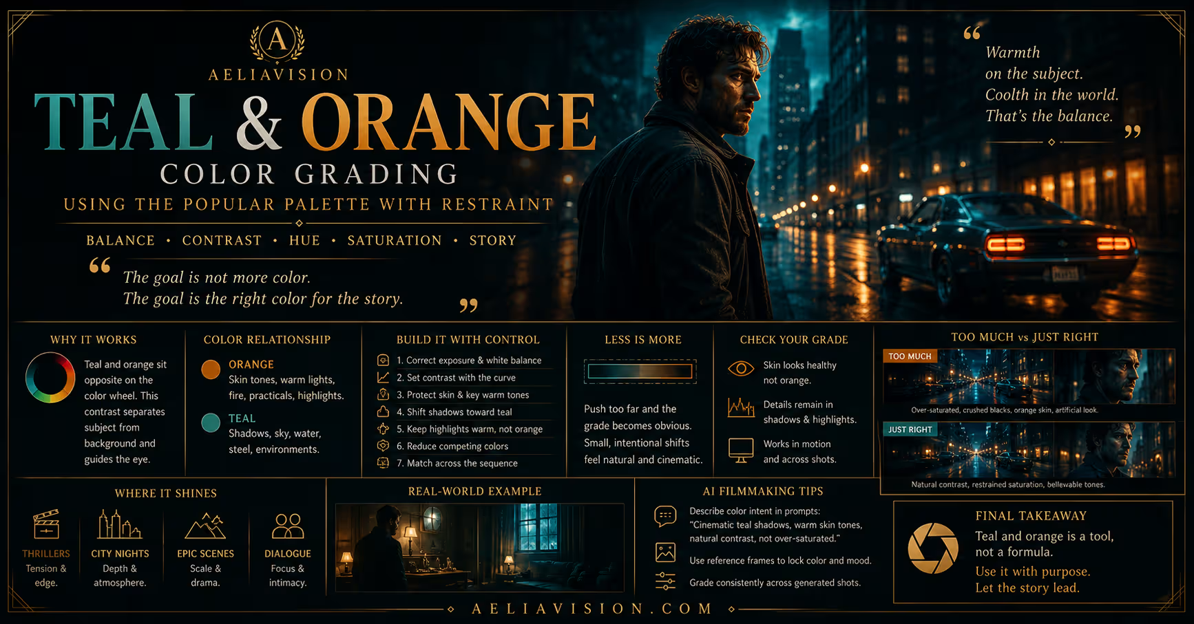
Skin tone should be protected before the creative look becomes too aggressive. For example, if you are pushing shadows toward teal and highlights toward warmth, make sure the skin does not become orange, red, gray, or unnatural in the process.
Power windows and viewer attention
Cinematic grading is not only about color. It is also about guiding the viewer’s eye. Power Windows allow you to isolate areas of the frame so you can brighten a face, darken a background, reduce saturation in a distracting object, or create a subtle vignette.
The goal is not to make the window obvious. The goal is to make the audience look where the story wants them to look.
For example, in a dramatic close-up, you may slightly lift the actor’s eyes, darken the edges of the frame, and reduce saturation behind the subject. The viewer will feel more focused without noticing the grade.
Always soften windows unless you are creating a specific graphic effect. Hard window edges usually make a grade look amateur.
Building a cinematic film look
A film look is not one single effect. It is a combination of contrast behavior, color separation, highlight roll-off, grain, texture, halation, saturation control, and emotional palette. The goal is not to make digital footage look old by default. The goal is to give the image organic behavior and visual depth.
Highlight roll-off
Digital highlights can clip harshly, especially in skies, windows, lamps, and reflective surfaces. Film tends to roll highlights more softly. To create a more filmic image, protect highlight detail and use curves, HDR wheels, or highlight controls to compress bright areas smoothly.
Avoid making whites look dull or gray. The goal is not to flatten the image. The goal is to make bright areas feel elegant instead of harsh.
Soft blacks
Many film emulation looks use slightly lifted blacks. This does not mean the footage should look washed out. It means the darkest parts of the image are softened so they do not feel digitally crushed.
Lifted blacks can create a vintage or print-film feeling. Deep blacks can create a more modern, dramatic, premium look. The right choice depends on the story, genre, and visual language of the project.
Color separation
Cinematic images often use separation between subject and environment. This can be achieved through lighting, production design, wardrobe, location, and grading.
A subject may have warm skin against a cooler background. A night scene may use blue shadows with warm practical lights. A desert scene may use warm highlights with muted cyan shadows. A sci-fi scene may place human warmth against metallic blues or greens.
The important thing is balance. Too much color separation becomes a cliché. Subtle separation feels cinematic.
Film grain
Film grain adds texture and can help reduce the overly clean feeling of digital footage. In DaVinci Resolve Studio, the Film Grain effect can simulate different grain sizes and strengths.
Use grain carefully. Too much grain can make the image noisy and distracting. For 4K delivery, finer grain usually feels more elegant. For gritty drama, horror, war, or documentary-style work, stronger grain may be appropriate.
Grain should usually be added near the end of the node tree, after the main grade has been built.
Halation and bloom
Halation is the subtle glow or color bleed that appears around bright highlights in some film stocks. It is commonly seen around lamps, windows, candles, headlights, and bright edges.
In Resolve, halation can be created with Glow, custom node setups, or third-party tools. The key is subtlety. If halation is visible everywhere, it starts to look like a cheap effect. It should mostly live in strong highlights.
Bloom can soften bright areas and create a more organic image, but it should not destroy sharpness or make the entire frame hazy.
LUTs: useful tool, not a magic button
LUTs, or Look-Up Tables, are often misunderstood. A LUT transforms color values from one state to another. Some LUTs are technical, while others are creative.
A technical LUT converts footage from one color space or gamma to another. For example, it may convert log footage to Rec.709.
A creative LUT adds a stylized look. It may emulate a film stock, create teal-orange contrast, add vintage tones, or give a commercial polish.
The danger is using creative LUTs as a shortcut before the image is corrected. If your exposure, white balance, and contrast are wrong, the LUT will exaggerate the problem.
A better LUT workflow is to correct the image first, normalize the footage through color management or a Color Space Transform, apply the LUT on its own node, reduce the LUT strength if needed, adjust contrast and saturation after the LUT, protect skin tone, and check the result on scopes.
LUTs are best used as starting points or finishing tools, not as the entire grade.
1d LUTs vs. 3d LUTs
A 1D LUT affects each color channel independently. It is useful for simple gamma or contrast transformations, but it cannot fully model complex color relationships.
A 3D LUT works as a color cube and can map relationships between red, green, and blue together. This makes it better for creative looks, film emulation, and complex color transformations.
| LUT Type | Best Use | Limitation |
|---|---|---|
| 1D LUT | Gamma, contrast, simple log conversion | Cannot model complex color interaction |
| 3D LUT | Film looks, creative palettes, complex transforms | Can cause banding if low quality |
| Technical LUT | Camera or color space conversion | Must match the source footage |
| Creative LUT | Stylized look or film emulation | Should not replace correction |
For professional work, 33-point or 65-point 3D LUTs are generally safer than low-resolution LUTs because they reduce the risk of banding and artifacts.
The correct order of operations
There is no single perfect node order for every project, but a clean professional order usually follows a clear logic: input transform or color management first, exposure and white balance next, then contrast, saturation, shot matching, skin tone, creative look, film emulation, texture, and final delivery check.
| Order | Step | Reason |
|---|---|---|
| 1 | Input transform or color management | Makes Resolve interpret the footage correctly |
| 2 | Exposure and white balance | Builds the technical foundation |
| 3 | Contrast and saturation | Shapes the base image |
| 4 | Shot matching | Creates consistency across the scene |
| 5 | Skin tone and secondaries | Protects important human elements |
| 6 | Creative look | Adds mood and visual identity |
| 7 | Film emulation | Adds print behavior, grain, halation, or texture |
| 8 | Output transform and final check | Ensures correct delivery |
This order keeps the grade flexible. Technical corrections happen before style. Style happens before final delivery. Finishing checks happen last.
Shot matching: the hidden professional skill
A single beautiful shot is not enough. A scene must feel consistent. Shot matching means making multiple shots feel like they belong in the same lighting environment, emotional moment, and visual world.
Start by choosing a hero shot for the scene. This is the shot that best represents the intended look. Then match the other shots to it.
Check exposure first, then contrast, white balance, saturation, and color separation. Only after that should you match the creative look.
A common mistake is trying to match shots after applying a heavy LUT. It is usually easier to match shots before the creative look, then apply the look across the scene.
Using scopes to make repeatable decisions
Your eyes are important, but they are not enough. Room lighting, monitor calibration, fatigue, and screen differences can trick you. Scopes give objective feedback.
| Scope | What It Shows | Why It Matters |
|---|---|---|
| Waveform | Brightness and exposure levels | Helps avoid crushed blacks and clipped highlights |
| RGB Parade | Red, green, and blue channel balance | Helps identify color casts |
| Vectorscope | Hue and saturation direction | Useful for skin tone and color intensity |
| Histogram | General tonal distribution | Gives a broad view of shadows, mids, and highlights |
For skin tone, the vectorscope is especially useful. For exposure, the waveform is essential. For color casts, RGB Parade is one of the fastest diagnostic tools.
Cinematic looks by genre
Different genres often use different grading languages. These are not strict rules, but they are useful starting points.
| Genre | Common Color Behavior | Emotional Effect |
|---|---|---|
| Drama | Controlled contrast, natural skin, subtle saturation | Intimate, grounded, human |
| Horror | Cooler shadows, lower saturation, deep contrast, sickly greens | Unease, fear, tension |
| Action | Strong contrast, bold separation, crisp highlights | Energy, impact, danger |
| Romance | Warm highlights, soft contrast, gentle skin tones | Comfort, beauty, tenderness |
| Sci-Fi | Cyan shadows, metallic neutrals, neon accents | Technology, distance, futurism |
| Fantasy | Rich color worlds, glowing highlights, magical accents | Wonder, myth, imagination |
The best grade is not the most extreme one. The best grade is the one that supports the story.
Delivery and export: grading for the final platform
A grade is only successful if it survives delivery. Export settings must match where the video will be watched. A file intended for YouTube is not the same as a file intended for broadcast, cinema projection, or HDR streaming.
Youtube and web SDR
For standard YouTube, Vimeo, websites, and social platforms, Rec.709 SDR is usually the safest choice. A common delivery target is Rec.709 Gamma 2.4, although Mac-based workflows may require additional attention to gamma tagging and Rec.709-A depending on the review environment.
For compressed delivery, H.264 and H.265 are common. For high-quality masters, ProRes or DNxHR are better choices. Always check the final upload after processing because online platforms may slightly alter contrast, saturation, and brightness.
Broadcast
Broadcast delivery usually requires strict legal levels, Rec.709 color, and specific codec or container requirements. Always follow the broadcaster’s technical sheet. Do not assume that YouTube export settings are acceptable for television delivery.
Broadcast work often requires careful checking of luminance levels, color limits, audio specs, frame rate, and file format. When in doubt, deliver exactly to the broadcaster’s specification.
Digital cinema
For cinema projection, the grade may need to be converted to DCI-P3 and delivered as a DCP. Cinema projection has different brightness, contrast, and color behavior than a computer monitor. A grade that looks good on a laptop may feel too dark or too saturated in a theater.
If the project is intended for festivals or theatrical playback, test the grade in a proper projection environment whenever possible.
HDR
HDR grading uses wider color and brightness ranges, commonly Rec.2020 with PQ or HLG. HDR should not be treated as simply “brighter SDR.” It requires a dedicated monitoring workflow, proper metadata, and careful tone mapping for SDR versions.
If you deliver both HDR and SDR, create a proper SDR trim pass instead of trusting automatic conversion blindly. HDR and SDR are related, but they are not the same visual experience.
Common color grading mistakes
One of the most common mistakes is overgrading. Beginners often push contrast, teal shadows, orange skin, heavy grain, strong vignette, and intense LUTs all at once. The result looks artificial instead of cinematic.
Another mistake is ignoring skin tone. Even if the background looks beautiful, bad skin tone can ruin the shot. Viewers are extremely sensitive to faces, even if they do not consciously understand color grading.
A third mistake is grading without color management. If Resolve does not know what color space your footage is in, your starting point may be wrong.
Another major issue is relying on LUTs too early. LUTs should support the grade, not replace the colorist.
Finally, many creators forget delivery. A beautiful grade inside Resolve can look wrong after export if color tags, gamma, levels, or compression settings are incorrect.
A practical DaVinci Resolve cinematic grading workflow
For most projects, use this workflow as a professional starting point:
- Set up project color management before grading.
- Import footage and confirm the camera color space.
- Choose a hero shot for each scene.
- Correct exposure and white balance.
- Match shots before heavy styling.
- Protect skin tones with qualifiers and windows.
- Build contrast carefully.
- Shape the palette based on story emotion.
- Add the creative look or LUT on a separate node.
- Add film texture, grain, glow, or halation subtly.
- Check scopes.
- Review the scene in motion, not only on still frames.
- Export using the correct delivery settings.
- Watch the final export outside Resolve.
This process is slower than dropping a LUT onto every clip, but it produces a cleaner, more professional, and more reliable result.
Build the grade around the story
DaVinci Resolve cinematic color grading is a balance between science and emotion. The science gives you accuracy, consistency, and control. The emotion gives the image meaning.
A professional colorist does not simply ask, “Does this look cool?” They ask, “Does this look right for the story?”
That mindset changes everything. Once you understand correction, color management, node structure, skin tone, film emulation, LUTs, scopes, shot matching, and delivery, Resolve becomes more than a grading tool. It becomes the place where your footage receives its final cinematic identity.
The goal is not to copy a Hollywood look blindly. The goal is to build a visual language that belongs to your film, your scene, and your audience.
Continue reading
Further insights from the Journal
Have a story in mind?
Bring your next project into focus.
Tell us what you are creating and what you want the audience to feel.