The story in brief
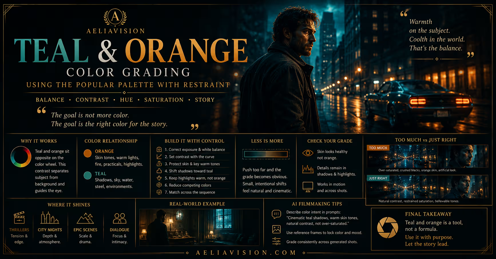
Teal and orange is one of the most recognizable color relationships in modern film and advertising. Cool blue-green tones often occupy the shadows, sky, or environment, while warm orange remains in skin, practical lights, and selected highlights. The contrast helps a subject…
Inside this story
Teal and orange is one of the most recognizable color relationships in modern film and advertising. Cool blue-green tones often occupy the shadows, sky, or environment, while warm orange remains in skin, practical lights, and selected highlights. The contrast helps a subject separate from the world around them.
The palette works because it follows relationships that already exist in many scenes. Skin often carries warm red and orange information. Sky, water, steel, and shadow can carry blue or cyan information. Moving those families slightly apart creates a readable image.
The problem starts when the treatment becomes automatic. A strong teal and orange split applied to every shot can make a project feel like it came from the same preset. Skin turns orange, shadows turn electric blue, and the grade begins to announce itself before the story has a chance to do anything.
This guide explains why the palette works, how to build it, when to avoid it, and how to use it in AI-generated images and video without producing a generic blockbuster look.
Why teal and orange works
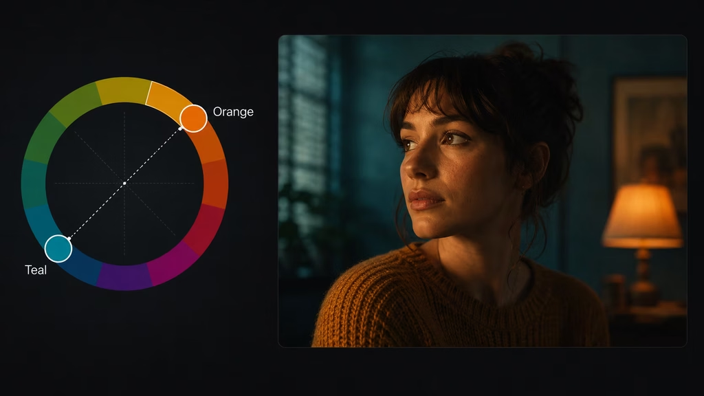
Color contrast helps the eye separate objects. Warm and cool hues sit apart on the color wheel, so placing them in different areas of the frame creates clear visual division.
The most common arrangement puts warmth on the subject and cool color in the surroundings. An actor with natural skin stands against a blue-gray wall. A warm practical glows inside a cool room. A red-orange car moves through a cyan night street. The subject reads quickly because its color is different from the environment.
This is not the only arrangement. Cool skin under blue light can work when the story calls for distance or illness. A warm background with a cool subject can create alienation. The palette is useful because it gives you a relationship to control, not because orange must always belong to skin.
The grade should follow the light. If the frame contains a warm lamp and cool window, the colors have a physical explanation. If every shadow becomes teal despite neutral light, the effect may feel imposed.
Building a restrained teal and orange grade
Start with correction. Balance exposure and white balance before adding the split. If the image is already too warm, pushing highlights toward orange will make skin harder to control. If shadows are crushed, pushing them teal may turn them into colored black.
Set the broad contrast first. Decide whether the image needs soft transitions or stronger separation. Then shape the cool and warm families separately.
A practical order is:
- Correct exposure and white balance.
- Set a moderate contrast curve.
- Protect skin and important warm objects.
- Move selected shadows or cool surfaces toward teal.
- Keep highlights warm without making them orange.
- Reduce competing colors.
- Match the treatment across the sequence.
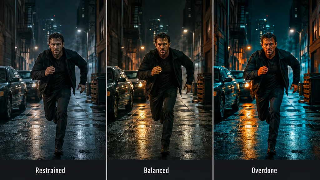
The effect should be visible in the relationships, not necessarily in every pixel. A small shift may be enough. If the viewer notices the color split before the character or action, reduce it.
Teal in shadows and environments
Teal often enters through shadows, sky, water, distant buildings, or cool practical sources. It can make the environment feel cleaner and more separated from the subject.
Use a gentle hue shift rather than a full replacement. Blue-gray shadows can move toward teal while retaining texture. Green walls can be controlled so they do not become fluorescent. Steel and concrete can carry a cool tone without looking painted.
Watch the shadow saturation. Highly saturated teal in the darkest values can look digital and heavy. Lower saturation in the deepest shadows and let the midtones carry the color.
If the environment already contains cyan, the grade may need only a small contrast adjustment. Do not push the hue just because the palette name calls for it.
Orange in skin and highlights
Warmth usually belongs in skin, practical bulbs, sunlight, wood, and selected reflections. The warm color should describe the light or the subject, not cover the image in orange.
Protect the face. A skin qualifier can reduce saturation or shift the hue slightly while the background becomes cooler. Keep the adjustment soft and check it in motion.
Highlights can carry warmth without becoming orange. Use gain or highlight controls carefully. Bright lamps may clip, but faces and reflective materials should retain variation.
A warm face against a cool background works because the color is controlled. If the entire frame is orange, there is no separation left.
The role of skin tone
Skin is the most common failure point in teal and orange grading. The palette encourages a warm subject, but warmth has a limit. Orange skin can make every scene look sunburned or artificially lit.
Use a vectorscope as a reference. Then check the face without scopes. A technically close hue can still look wrong if the saturation or brightness is excessive.
Keep differences between people. Do not force every face into the same orange value. Skin tone, makeup, light direction, and reflected color vary. Match the scene’s logic rather than flattening the people into a palette sample.
If the environment is strongly teal, a natural face may appear warmer by comparison even without a large hue shift. Let the contrast between areas do some of the work.
When the palette becomes a cliche
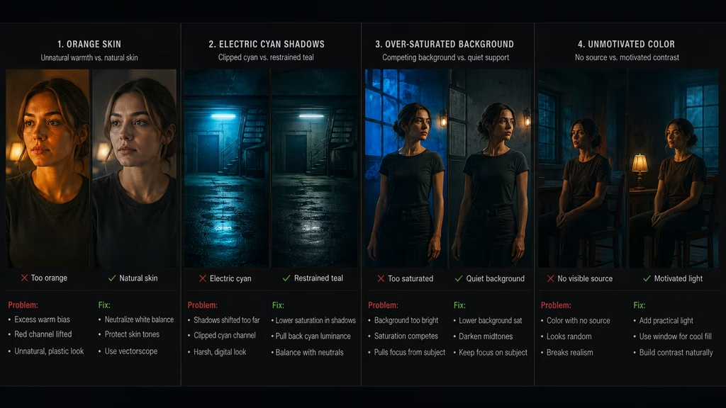
The treatment becomes a cliche when it appears without a story reason, uses the same strength in every scene, or pushes both hues beyond believable light.
Warning signs include:
- Skin that is bright orange
- Shadows that are electric cyan
- Every scene using the same split
- Neutral objects changing color without a source
- A grade that looks like a preset before the audience sees the action
- Color contrast doing more work than lighting or composition
The solution is not always to abandon the palette. Reduce the strength, change the second hue, or motivate it with real sources. Use green and amber, blue and warm white, cyan and magenta, or mostly neutral color with one warm accent when the story calls for a different relationship.
Lighting the palette on set
A motivated teal and orange grade is easier when the scene already contains warm and cool sources. A warm practical against cool daylight gives the colorist something to preserve. A warm key with cool fill can separate the subject. A cool background with a warm rim can create depth.
The sources do not have to be extreme. Small differences in temperature can become visible after correction and grading. Keep the light direction consistent, and avoid adding color without knowing what surface it will hit.
Warm practicals can clip or reflect strongly on skin. Cool windows can flatten faces if the fill is too weak. Balance the sources before the grade has to solve the problem.
For AI images, show the source in the prompt when possible. “Warm lamp visible on the table” is more useful than “orange cinematic lighting.” The model can use the source to decide where warmth belongs.
Palette and contrast
Teal and orange depends on separation, but separation can come from value as well as hue. A warm face against a dark cool background reads differently from a warm face against a bright cool background.
Use contrast to support the palette. A darker environment can make a warm subject stand out. A softer grade can let the hues blend and create a more natural scene. The same colors can therefore support different emotions.
A thriller may use dense cool shadows and a small warm practical. A romance may use soft warm skin and a pale blue background. An action film may use harder contrast and stronger separation. The palette remains related, but the contrast changes the pressure.
Palette and saturation
Lower background saturation often helps the warm subject read without over-saturating skin. Reduce competing greens, yellows, and reds when they pull attention away from the intended subject.
Keep product colors accurate when working on commercials. A blue product should not become teal simply because the background palette is cool. Use a local adjustment or protect the object.
Saturation should vary across the frame. The environment may be quiet while the subject or a practical carries stronger color. This creates hierarchy.
Teal and orange for different genres
Action
Action films often use the palette because it separates warm subjects and vehicles from cool streets, skies, or industrial environments. Keep motion readable and do not let saturated color obscure the action.
Thriller
A restrained split can make a cool world feel controlled and a warm face feel vulnerable. Use shadows carefully so clues and expressions remain visible.
Romance
Warm skin against a cool evening environment can create intimacy without turning the frame entirely golden. Keep the skin soft and the background restrained.
Horror
Teal and orange may be too familiar for a horror scene. Shift the cool family toward sickly green, the warm family toward dull amber, or use a different palette so the result feels less like a default blockbuster.
Science fiction
Cyan and amber can support technology and human presence, but the grade should have a reason. Screens, practicals, and reflected light can motivate the relationship.
Commercial work
The palette helps products and people separate from the environment. Use it with accurate materials and controlled reflections, especially for metal, glass, and skin.
Teal and orange in AI image generation
AI models have seen many examples of this treatment, so the words can trigger a familiar cinematic look quickly. That convenience is useful, but it also increases the risk of generic output.
Describe the exact relationship:
“Cool blue-green shadows in the concrete environment, naturally warm skin from a visible tungsten practical, moderate contrast, restrained saturation, no orange cast.”
For a subtle version:
“Mostly neutral grade with a slight cool shift in shadows and a small warm accent on the face and lamp.”
For a scene that avoids the cliche:
“Use cool steel-blue surroundings and warm white skin, not exaggerated teal and orange, with gentle contrast and realistic materials.”
The model needs to know what not to exaggerate. Use direct constraints rather than repeating the palette name.
Teal and orange in image-to-video
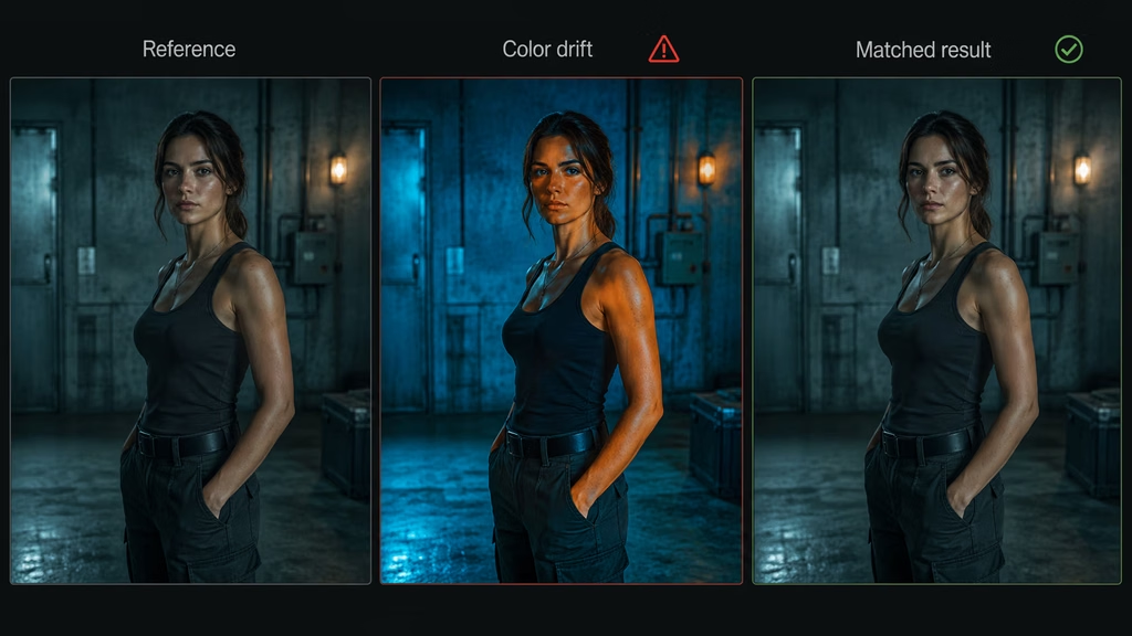
The palette can drift during motion. Skin may warm as the subject turns. Shadows may become blue or green for no reason. A practical light may change intensity. These shifts are easier to notice because the color relationship is strong.
Use a reference frame and a continuity instruction:
“Preserve the restrained teal and orange relationship from the reference image. Keep the environment cool blue-green, keep the practical and skin naturally warm, and maintain the same saturation during the slow tracking shot.”
Keep movement moderate when the color design is important. Short clips are easier to correct than long clips with several changes in camera path and light.
If the character moves from a cool room into warm light, describe the transition. The temperature change should happen at the doorway or source, not randomly in the middle of the clip.
Matching the palette across shots
A sequence needs more than the same teal and orange label. Match the strength, contrast, skin tone, shadow saturation, highlight warmth, and relationship between subject and environment.
Use a hero frame for each scene. Correct the new shot toward the hero before applying the creative look. Compare the face and a neutral surface if both appear.
Watch the cut. The audience may not notice a small hue difference in a still, but the shift can feel like a flash when two angles alternate.
If a new location contains different light, let the palette adapt. A warm kitchen and a cool parking garage should not have identical color values. They can still belong to the same project through contrast, saturation discipline, and skin treatment.
Teal and orange with film emulation
Film-emulation tools can change contrast, saturation, and hue at once. A preset that already contains warm highlights and cool shadows may push the palette too far when combined with a manual split.
Apply one major treatment at a time. If the film emulation supplies the color relationship, refine it rather than adding a second full-strength teal and orange grade. Keep the nodes separate so you can see what each stage does.
Grain and halation can soften the digital quality, but they do not make an exaggerated split believable. Control the colors first, then add texture.
Common mistakes
Turning skin orange
Warmth should support the face, not replace its natural color. Reduce saturation, protect the midtones, or let the background become cooler instead of pushing the skin harder.
Making shadows electric cyan
Deep shadow saturation creates a digital look quickly. Keep the cool shift subtle, especially in the darkest values.
Applying the same split to every scene
Let some scenes stay neutral or use a related but different palette. Contrast gives the treatment meaning when it appears.
Ignoring the light source
If the image contains no practical, window, screen, sky, or reflected source to explain the colors, the grade may feel imposed. Motivate the palette through lighting or accept that the style is abstract.
Over-saturating the background
A cool environment does not need to be bright blue. Lower the background saturation so the subject remains readable.
Losing product accuracy
Commercial subjects need believable materials and accurate color. Protect the product from a palette adjustment that changes what it is.
Combining too many color effects
Teal and orange, bleach bypass, heavy film emulation, glow, and strong halation can fight each other. Build the look in stages and remove effects that do not help.
Using the palette without a story reason
A familiar treatment cannot replace lighting, composition, or performance. If the scene does not benefit from the warm-cool relationship, choose a simpler grade.
Alternative palettes
The reason to understand teal and orange is not to use it everywhere. It gives you a reference point for designing other relationships.
Try warm white and steel blue for a cleaner modern look. Use green and amber for unease or industrial tension. Use cyan and magenta for a synthetic, neon world. Use red and gray when danger needs to dominate. Use mostly neutral color with one accent when the story needs restraint.
Keep the same discipline with every palette. Decide where the colors belong, protect skin and important materials, and match the treatment across the scene.
A practical teal and orange workflow
Write the scene intention before opening the grade. What should feel warm? What should feel cool? Is the relationship physical, emotional, or both?
Correct exposure and white balance. Keep the original and a neutral corrected version.
Set contrast and protect the face. Do not start by pushing the hues.
Choose the cool family. Decide whether it belongs in shadows, background, sky, or a practical source.
Choose the warm family. Decide whether it belongs in skin, highlights, lamps, or a product.
Lower saturation in competing colors. Keep the frame’s hierarchy clear.
Apply the split gently. Compare it with the neutral version and with the next shot.
Track skin masks and check motion. Watch for flicker and hue drift.
Save the node tree. Keep correction, palette, skin protection, and final trim separate.
For AI, use a reference frame and describe the relationship during motion. Generate short tests before committing to a long clip.
Teal and orange in the AeliaVision workflow
Store the palette decision in the project’s Color Palette and Lighting DNA. Record the warm and cool sources, the acceptable saturation, the skin-tone rule, and the scenes where the palette should change.
AeliaDirector shot planning can use the relationship as part of visual language. A cool environment and warm face may mark a character who remains human inside a controlled world. A warm practical may signal safety, while a cool background suggests the threat outside it.
For AI filmmaking, keep the same palette reference across image generation, image-to-video, and post. Correct each shot before grading, and review the sequence rather than relying on one successful still.
Final checklist
Before approving a teal and orange grade, ask:
- What physical or emotional reason supports the warm and cool relationship?
- Are faces natural and consistent?
- Are the cool shadows restrained enough to retain texture?
- Does the palette support the subject instead of competing with it?
- Are practicals, windows, and reflections believable?
- Does the treatment match nearby shots?
- Is the grade too similar to a generic preset?
- Would a different palette serve this scene better?
- Does the AI clip hold the color relationship during motion?
- Can you return to a corrected version if the treatment becomes too strong?
Conclusion
Teal and orange works because it creates a clear warm-cool relationship between subject and environment. It can help faces separate from a blue world, make practical light feel important, and give action or commercial images a readable color structure.
It fails when it becomes automatic. Orange skin, electric cyan shadows, and identical treatment in every scene make the grade feel borrowed rather than directed. Correct the image first, protect faces and materials, keep saturation under control, and let the light motivate the palette.
In AI prompts, describe where the warm and cool color belongs, how strong it should be, and what must remain natural. Use reference frames for continuity, then refine the generated footage in post.
The palette is a relationship. Keep the relationship believable, and the image can be stylized without looking generic.
Related Articles
- Color Correction vs Grading Guide
- Contrast and Saturation Guide
- Skin Tone Guide
- Color Temperature Guide
- LUTs Guide
- Node Trees Guide
- Shot Matching Guide
- Lighting Prompts Guide
- Avoid the Generic AI Look Guide
Tools & Resources
- Teal and Orange Grading Checklist
- Cinematic Palette Reference Chart
- AI Color Continuity Worksheet
- AeliaVision Color Palette Planner
Continue reading
Further insights from the Journal

Have a story in mind?
Bring your next project into focus.
Tell us what you are creating and what you want the audience to feel.