The story in brief
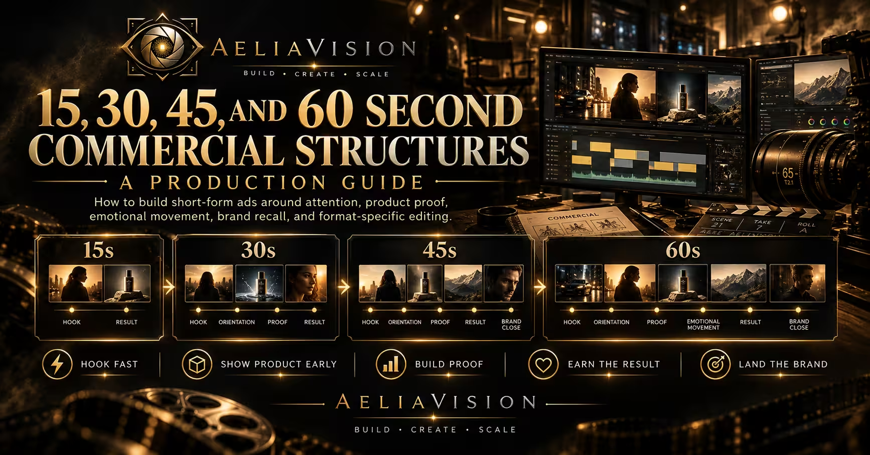
A practical guide to building 15, 30, 45, and 60 second commercial structures around attention, product proof, emotional movement, brand recall, and format-specific editing.
Inside this story
Commercial duration changes the story. It does not merely change the number of shots available to the editor. A 15-second spot has to establish a premise before the viewer decides to leave. A 30-second spot can give a product a situation and a result. At 45 seconds, a film can develop a turn without losing commercial clarity. At 60 seconds, it can earn an emotional arc, provided each section adds something the shorter version cannot carry.
Teams often treat the long film as the real idea and the shorter assets as its leftovers. That approach produces a familiar problem: the 60 feels composed, while the 30 is crowded and the 15 becomes a trailer for a commercial nobody will see. Every duration needs a complete thought. They may share the same campaign world, cast, footage, and promise, but they need separate editorial decisions.
The job of structure is simple to describe and difficult to execute. It decides what the audience receives first, what they understand next, where the product becomes necessary, and how the brand stays in memory. Good structure protects those decisions when coverage multiplies, stakeholders add requests, and the media plan asks for a new cut a week before launch.
This guide is for directors, creative teams, producers, brand marketers, editors, and in-house studios making short-form advertising. It covers the core sequence behind 15, 30, 45, and 60 second commercials, how to write each one, what to protect in production, and how to review a cut before polish conceals its weaknesses.
Treat time as a budget
A commercial has two budgets. One is money. The other is attention. The second budget is less forgiving because it cannot be borrowed from the next shot. If a five-second opening does not create curiosity, information, or a clear feeling, the audience may never reach the product demonstration that follows.
Start with the commercial’s single required change in perception. A meal delivery brand might need to move from “this is more work than cooking” to “I can make a decent dinner after a difficult day.” A car campaign might need to move from “electric means compromise” to “this vehicle feels composed and responsive.” A business software ad might need to move from “switching tools is disruptive” to “this removes a recurring task my team already dislikes.” That change is more useful than a list of campaign messages.
Then identify the evidence that can make the change believable on screen. Product evidence may be a visible result, a physical detail, an interface flow, an expert explanation, a service interaction, or the changed behavior of a person after using the product. Emotional atmosphere can make that evidence more memorable, but it cannot replace it. The audience should not have to infer the category, benefit, and brand from a logo that appears at the end.
Think of every second as performing one of five jobs:
– It attracts attention with an image, action, line, or sound that belongs to the idea. – It establishes the human situation or visual world. – It gives the product a credible role. – It makes the result felt, understood, or desired. – It leaves the brand, offer, or next action clear enough to recall.
A 15-second ad may combine several jobs in one frame. A 60-second film may give each job more room. The jobs remain the same. When a shot cannot be connected to one of them, it may be beautiful coverage rather than useful coverage.
Write the promise before the timeline
A beat sheet should not begin with timestamps. Begin with a sentence that names the viewer, the tension, the offer, and the intended result. For example: “People who put off arranging home repairs should see that booking a reliable visit can be quick, clear, and less stressful than they expect.” This statement gives the film a practical center.
Avoid promises built from general brand language. “Feel the difference” and “better for every day” may be approved lines, but they do not tell a crew what to photograph. Ask what the difference is and what an ordinary person would notice. If the answer involves a click, a task completed, a clean surface, a time saved, a material felt, or a social moment made easier, the film has something to stage.
The next question is where the product enters. In a short commercial, delay can be expensive. A highly familiar brand may choose to withhold the full object for a few seconds, but it should still give the audience a recognizable cue. A new or practical product usually benefits from earlier orientation. A viewer who spends half the spot decoding the category has little time left to understand the benefit.
Write a claim map alongside the beat sheet. Put approved copy, qualifications, legal requirements, product facts, mandatory marks, and call to action in one document. This is not paperwork added after the creative work. It prevents a structurally sound film from collapsing under an end card that suddenly needs a price, a date, two product variants, an eligibility line, and an app store badge.

The shared spine: hook, orientation, proof, result, close
Many commercials use different genres. One may be a product demonstration. Another may use comedy, documentary observation, spectacle, a character story, or a sequence of tactile product images. The genre changes the surface. Most successful spots still give the viewer a version of the same spine.
The hook is the reason to look. It can be a striking product action, an unusual point of view, a recognizable tension, a direct line, or a sound that makes a viewer notice the screen. It should not be a generic burst of speed added because someone asked for stronger first seconds. If the campaign is about calm, the hook may be a sudden absence of noise. If it is about performance, the hook may be the exact moment a task becomes difficult.
Orientation lets the viewer understand the scene. It might identify a location, a relationship, a task, or a category. Orientation does not require an establishing shot. A hand trying to force an overfilled suitcase closed tells us enough about the moment. An employee waiting for a spreadsheet to update tells us something different. The audience only needs the context that makes the product’s role meaningful.
Proof is where the product earns its position. For a stain remover, show the relevant stain and the result. For a banking app, show a task that was uncertain becoming confirmed. For a premium object, proof might be material, construction, use, or service detail. A product close-up with no function can build desire, but it may not resolve skepticism. Decide which kind of proof the category needs before production.
The result should express the benefit in a human or sensory way. The repaired item works. The person leaves on time. The room feels less cluttered. A traveler has the information they need. A person uses a product with evident pleasure. Results are stronger when they are proportionate. A phone plan does not need to save a wedding. It may let someone call home without watching a cost meter.
The close is the moment when the viewer connects the experience to the brand. A pack shot, logo, offer, line of copy, URL, voiceover, or app screen can all play a role. The final frame needs hierarchy. One thing should be easiest to read. If the audience must scan five equal elements, the close becomes administration rather than recall.
The 15-second commercial: one clear move
Fifteen seconds is not a smaller thirty. It is a concentrated idea. The audience should understand the premise, meet the product, see one convincing reason to care, and receive the brand close. There is little room for a slow setup, multiple benefits, or a twist that needs explanation afterward.
A useful 15-second structure often looks like this:
– Seconds 0 to 2: an immediate tension, product cue, or action. – Seconds 2 to 6: orientation and product introduction, often in the same sequence. – Seconds 6 to 11: one proof point and its visible or emotional result. – Seconds 11 to 15: hero frame, brand, offer, and action.
These are working ranges, not laws. A beauty spot may put product texture in the opening and reserve the person or ritual for the middle. A retail offer may name the brand in the first second because the promotion depends on recognition. A service ad may use the first three seconds to state a problem directly, then show a simple process and a branded close.
The discipline is choosing one benefit. A fifteen-second ad cannot convincingly demonstrate faster setup, lower cost, better support, more color choices, environmental credentials, and a new loyalty program. It can mention more than one thing, but only one idea will likely survive in memory. Pick the benefit that matches the placement and audience. A retargeting ad can rely on existing knowledge. A prospecting ad needs more category clarity.
Use a visual sentence rather than a miniature montage. A person sees a crowded calendar, opens an appointment app, receives a confirmed slot, and walks away from the desk relieved. That sequence has cause and effect. It is easier to follow than six unrelated images of phone screens, smiling staff, city aerials, and product beauty shots.
Sound needs a concise plan. A single satisfying product sound, a line of dialogue, or a clean music cue can give the edit shape. Do not spend half the runtime on a musical build that only pays off after the message has already passed. The viewer may see the spot with sound off, so the image must still describe the essential action.
The brand close needs enough time to read on a phone. One second can be enough for a familiar mark paired with a product already shown clearly. It is rarely enough for dense terms, a new company name, a product image, and a call to action. If the close has too much work to do, solve that in the script rather than shrinking type until it technically fits.
The 30-second commercial: context plus proof
Thirty seconds remains the standard commercial duration because it has room for a small story. It can introduce a person or situation, give the product a motivated entrance, show evidence, and let the benefit settle before the close. It is long enough to create a tonal world, but short enough that every section must add information.
A dependable 30-second shape is:
– Seconds 0 to 4: hook and a readable situation. – Seconds 4 to 10: tension or desire becomes specific. – Seconds 10 to 19: product introduction and central demonstration. – Seconds 19 to 25: result, reaction, or second proof. – Seconds 25 to 30: product hero, brand close, and required message.
For a character-led ad, the first ten seconds should contain behavior, not exposition. Show the person trying to do something. Let the audience see the obstacle through the action. A parent attempts to make a call while managing a noisy room. A traveler realizes their battery is nearly gone. A shop owner waits on a task that keeps them from closing. These are playable situations. They give the product a reason to arrive.
The middle is where many 30-second spots fail. Teams devote time to setting a mood, then rush the product into two fragments and move immediately to an end card. Protect the product sequence in the shot list and schedule. Capture a clear hero frame, an action frame, and a result frame. For apps and services, capture the screen or process at a scale where a viewer can read what has changed.
A 30 can hold two proof points if they support one promise. A vehicle film might show quiet cabin comfort and a controlled response, both supporting composure. A food product may show convenience and a finished meal, both supporting an easier dinner. Do not introduce an unrelated feature merely because it exists in the marketing deck.
Comedy often fits 30 seconds better than 15 because it needs setup, expectation, and reaction. The product should still enter before the joke consumes the entire runtime. Film alternate pauses and reactions. Editors often find the best timing between takes, not in the version where every word was delivered at full speed.
The 45-second commercial: make room for a turn
Forty-five seconds is often treated as an awkward compromise. It can be useful precisely because it creates space between a compact product ad and a full one-minute film. The additional 15 seconds can hold an emotional change, a second location, a more substantial demonstration, or a contrast between the old way and the new one.
The key is not to stretch the 30 by extending slow motion, music, or reaction shots. A 45 needs a new beat. That beat may be a reversal in the character’s understanding, a deeper product proof, a second person affected by the result, or a shift from private tension to public ease.
A practical structure is:
– Seconds 0 to 5: hook and orientation. – Seconds 5 to 14: problem, desire, or premise develops. – Seconds 14 to 27: product role and first proof. – Seconds 27 to 36: turn, expanded result, or second proof. – Seconds 36 to 45: product hero and brand close.
Consider an ad for a business tool. The opening shows a manager trying to reconcile last-minute changes before a client call. The product does not only fix a screen problem. It creates a more orderly working moment, then allows the manager to arrive at the call prepared. That second consequence earns the longer duration. It changes the film from a software demo into a story about the work the software makes possible.
For a consumer product, the turn can show the product moving through a relationship. A meal kit may begin as a practical answer to dinner planning, then reveal two people talking while they cook. A travel service may begin with an uncertain booking decision, then show the confidence of arrival. The human scene should remain credible. Avoid treating the result as magical transformation unless the campaign deliberately embraces fantasy.
The 45 is also useful when the product needs explanation but the brand wants visual character. Use the first section to establish a world and a question. Use the middle to answer the question with product evidence. Use the final section to show what the answer changes. This gives a director room for atmosphere without asking the audience to wait too long for relevance.
Review the mid-point carefully. At around 20 to 25 seconds, a viewer should know what the product is and why it matters. If the film remains mysterious past that point, the extended time is not helping. It is delaying the sale.
The 60-second commercial: earn the full minute
A minute is long enough to build a small narrative, but only if the product belongs to the narrative. The common failure is a short film with a commercial attached. The viewer experiences an attractive scene, then receives a late product reveal that has little causal relationship to what came before. The brand has paid for atmosphere without gaining a reason to be remembered.
A 60-second structure can work like this:
– Seconds 0 to 7: a distinctive opening and the first emotional question. – Seconds 7 to 20: a character, setting, or visual world takes shape. – Seconds 20 to 35: tension grows and the product enters with a clear role. – Seconds 35 to 48: proof, consequence, and the central turn. – Seconds 48 to 60: result, product hero, brand close, and any required message.
This framework gives the opening room to breathe, but it does not excuse a vague first act. The audience needs a line of attention to follow. A person preparing for an important event, a service worker facing a difficult task, or an object moving through a tactile ritual can all carry a minute if each section changes the information or feeling.
Use the extra time to show cause and effect. A home renovation service may show the burden of postponing a repair, the booking process, the visit, and the calm of a space working again. A financial service may show a person deciding whether to act, receiving clear guidance, and taking a next step with less uncertainty. A product story may follow an object from detail to use to shared consequence. The film earns its runtime by connecting the pieces.
A 60 can also hold contrast. Show an established habit, then show the better route without making the old route absurd. The old process should feel recognizable, not incompetent. People often tolerate inefficient routines because they know them. A convincing commercial acknowledges that reality and demonstrates a meaningful improvement.
Longer commercials need rhythm changes. Hold a quiet detail, then move into a clear action. Follow a close product frame with a wider human consequence. Allow music and sound to build, then reduce them for a line or an important product action. Constant intensity makes a minute feel longer than it is.
The close should not feel rushed merely because the film used its time well. Reserve it in the script. A final product frame may need room for a name, offer, legal line, and a visual resolution that matches the campaign. If that material is forced into the last two seconds, the audience will remember the scramble rather than the story.
Shoot for structures, not only for a master edit
The production plan should assume that each duration needs its own opening, proof, and close. This changes what the crew captures. Do not shoot one elegant 60-second sequence and hope post can extract a 15 from its middle.
Capture several kinds of hooks. A 60 can open with atmosphere. A 15 may need a direct product action or an immediate tension. Shoot a clean version of both. For example, a car campaign might use rain and sound to open the long film, while the short version begins with the door closing and the cabin becoming quiet. Both can be true to the same idea.
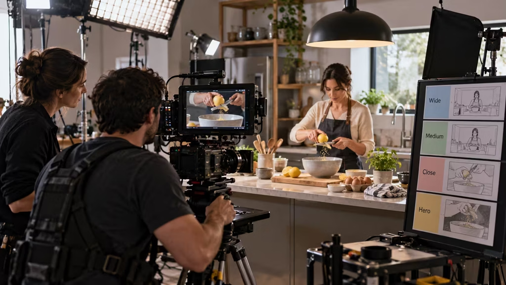
Protect modular evidence. Get wide, medium, close, and clean product coverage for the key proof. Shoot a usable result reaction with and without dialogue. Record copy variations that state the benefit at different lengths. Capture clean plates, end card backgrounds, and vertical-safe compositions. Ask the art department to check product position and label direction in every hero setup.
For screen-based products, plan which screens can carry the shorter edit by themselves. A 60 might show a multi-step workflow. A 15 needs one visible action with an obvious success state. Use approved designs and practical screen content when possible. A performer tapping through a blank phone gives the editor no actual proof.
Shoot alternate endings. The long version may resolve with a human scene before moving to the product. The short version may need product and brand in the same final frame. A retail cut may need a looping end state. These needs are inexpensive to capture when planned and expensive to invent after the set has wrapped.

Edit each duration as its own argument
Begin with a clarity cut. Before refining music, transitions, color, or sound design, check whether the viewer can answer basic questions. What is happening? What is the product or service? Why does it matter now? What changes because of it? Who is behind the message? If a cut fails these questions, adding polish will make it harder to identify the structural problem.
Edit the 15 first when the campaign requires all four durations. It forces the team to identify the smallest complete version of the idea. Once that version works, the 30 can add context, the 45 can add a turn, and the 60 can add emotional texture or a fuller journey. This does not mean the 15 is creatively superior. It means it exposes whether the campaign has a focused core.
Do not assume the short edit must follow the same chronological order. A 60 may begin with a situation, reveal the product in the middle, and land on a result. A 15 may work better by opening on the result, showing the product action, and closing with the brand. The essential promise should remain consistent, but the route to it can change.
Use sound to join the versions. A product sound, a musical motif, a recurring line, or a distinctive pause can make different lengths feel like a campaign rather than unrelated assets. Keep the sound hierarchy practical. Dialogue, claims, and essential product sounds must survive mobile playback. A refined low-frequency mix that disappears on a phone is not a durable structural device.
Watch each cut silently. The first image, product action, and close should still be understandable. Then listen without watching. The sound should have a beginning, a change, and a resolution. If the audio only works because the music tells the audience how to feel, the image sequence may lack its own progression.
Review with questions that lead to decisions
Feedback becomes vague when a group is asked whether a commercial “works.” Ask questions tied to the structure instead.
– Does the first frame give the intended viewer a reason to continue? – Is the category or human situation clear before the product arrives? – Does the product appear early enough for this duration and placement? – What specific evidence makes the claim believable? – Does every middle section add new information, feeling, or consequence? – Is the result proportional to the promise? – Can a person read the product, brand, offer, and legal copy at normal viewing speed? – Does the shorter version feel complete rather than like an excerpt?
Collect feedback through a single owner when possible. The producer, agency lead, or brand lead should consolidate notes and identify conflicts. A request to “make it faster” might mean the product arrives too late, the opening is unclear, or the reviewer is worried about a placement. Solve the concern instead of cutting random frames.
Group notes by story, product, legal, brand, performance, sound, and format. A logo placement issue should not distract from a missing demonstration. Review structural notes first. The grade, mix, graphics, and retouching should reinforce the final sequence, not rescue a vague one.
Design the close for real screens
The end card is a scene, not an obligation. It needs the same visual grammar as the rest of the film. If the campaign uses warm natural light, tactile surfaces, and measured cuts, a sudden default graphic template may feel detached. Build the close out of the campaign’s own color, typography, sound, and product treatment.
Give the viewer one primary reading task. It might be the product name, the offer, the brand line, or a call to action. Other information should support that task. Test it at the actual delivery resolution and on a small device. Thin type, weak contrast, and very short legal holds can look acceptable in a review suite and fail in the places where people actually watch.
Plan accessibility at this stage. Provide captions for dialogue-led versions. Do not rely on color alone to explain a choice. Keep text large enough to read. Make sure the silent version tells the core story. These choices reduce confusion for every viewer, not only those using accessibility features.

Common structural mistakes
The first mistake is saving the product for the final moment. This can work for a famous brand or a deliberate reveal, but it often leaves too little time for understanding. A viewer should not have to wait until the pack shot to know what the commercial was about.
The second is treating duration as a cutting instruction. Removing shots from a 60-second master does not automatically create a 30, 15, or vertical asset. Each edit needs a clear opening, a complete benefit, and a usable close.
The third is loading every commercial with every claim. A single spot can support a campaign strategy, but it cannot replace a website, product page, retailer display, and sales conversation. Choose what the audience needs at that moment.
The fourth is confusing mystery with absence of information. Partial reveal can create desire. Confusion asks the audience to do work without a reward. Keep at least one clear line through the film: a task, a person, a product action, or a visual progression that reaches a recognizable result.
The fifth is failing to reserve time for end cards and legal copy. The product, claim, offer, logo, and conditions all need compositional hierarchy and real reading time. Treat them as part of the script from the first storyboard review.
A practical final check
Before approving a commercial structure, write down its answer to five short prompts: the opening invitation, the viewer’s situation, the central evidence, the changed condition, and the final brand message. Do this for every duration separately. If the 15 has no central evidence, or the 60 has no additional change after the 30-second point, the campaign needs another editorial pass.
The strongest commercial structures do not feel like a checklist while the audience watches. They feel inevitable because each frame prepares the next one. The viewer receives a reason to look, a situation they can understand, evidence that the product belongs there, and a clear final connection to the brand. That is enough to build a 15-second ad. It is also the foundation of a 60-second film worth watching to the end.
Continue reading
Further insights from the Journal
Have a story in mind?
Bring your next project into focus.
Tell us what you are creating and what you want the audience to feel.