
The story in brief
Composition is the part of photography that begins before the shutter is pressed. It is the set of choices that determines where the eye lands, how it moves through a frame, and what the picture seems to say. A camera can record…
Inside this story
Composition is the part of photography that begins before the shutter is pressed. It is the set of choices that determines where the eye lands, how it moves through a frame, and what the picture seems to say. A camera can record a beautiful sunset, an expressive face, or an interesting building, but the recording itself is not the composition. Composition comes from deciding what belongs in the frame, what stays out, how the subjects relate to one another, and how the viewer encounters the image.
Rules can help because they give you something concrete to look for. They can also become a trap when treated as laws. The best photographs often bend a rule for a reason. A centered subject may feel calm and deliberate. Empty space may make a portrait feel lonely. A crooked horizon may suggest instability rather than poor technique. The goal is not to make every frame conform to a diagram. The goal is to make intentional choices and understand the visual effect of each choice.
This guide covers the most useful composition principles for photography, from the familiar rule of thirds to less discussed decisions about edges, scale, rhythm, and visual weight. It is written for photographers using any camera, including a phone. Good composition is not locked inside a particular lens or format. It depends on attention.
Start with the frame, not the subject
Many weak photographs contain a good subject but a careless frame. A mountain may be dramatic, yet the image loses force if a bright sign competes with it at the edge. A person may have a remarkable expression, yet the portrait feels cramped because the crop cuts through an awkward joint. Before thinking about named rules, look at the entire rectangle.
Ask four basic questions:
- What is the main subject?
- Where does the eye go first?
- What pulls the eye away?
- Is there anything touching the frame edge that changes the meaning or balance?
These questions sound simple, but they slow down the automatic habit of pointing the camera at the most obvious object. When you look through a viewfinder or phone screen, scan the corners. Check the space above heads. Notice poles that appear to grow out of people, bright patches behind faces, and background lines that divide the picture in awkward places.
A useful exercise is to photograph the same subject from three distances. Make one frame wide enough to show context, one that gives the subject less room, and one that fills the frame. Compare what changes. The subject has not changed, but the relationship between subject and surroundings has. That relationship is where composition begins.
The rule of thirds
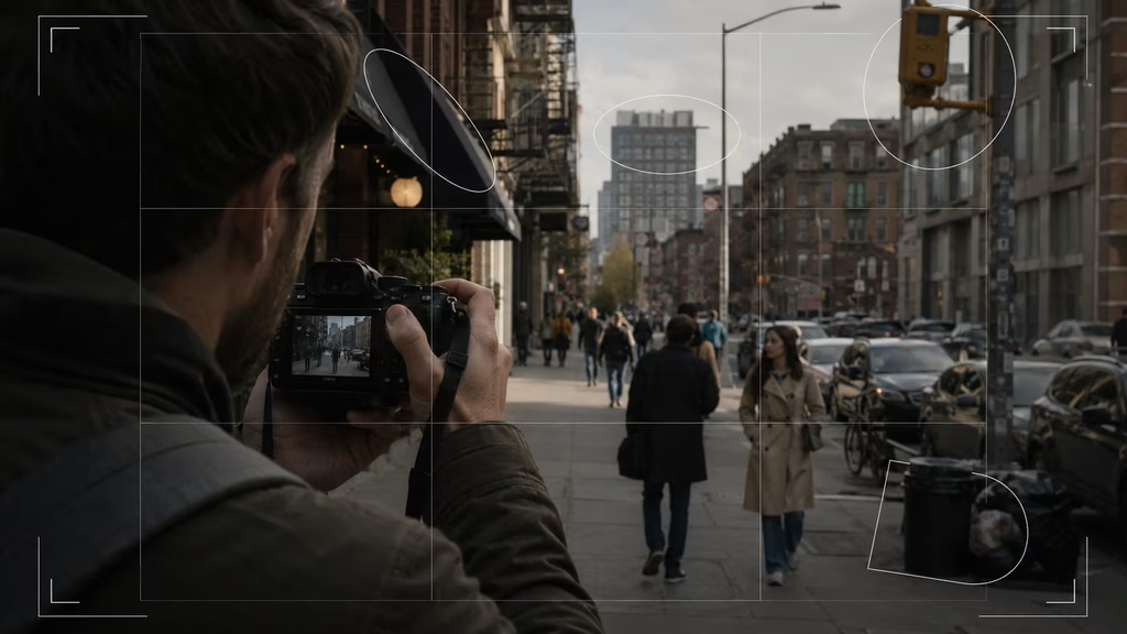
The rule of thirds divides the frame into nine equal rectangles using two horizontal and two vertical lines. Placing a subject near one of the four intersections often creates a balanced image with room for the subject to interact with its surroundings. It is especially useful when a centered composition feels static but a completely off-center placement feels accidental.
For a landscape, you might place the horizon on the lower third to give the sky more space, or on the upper third when the ground contains the stronger detail. For a portrait, placing one eye near an upper intersection can leave space in front of the face. For a person walking, place them toward one side and leave room in the direction of movement.
The rule works because people tend to read a frame relationally. A subject with breathing room can feel connected to its environment. A subject pressed against the edge can feel confined or hurried. The grid gives you a starting point for testing these relationships.
Do not place every horizon on the lower third by reflex. A horizon near the center can work when the image has a strong reflection, a symmetrical division, or a deliberate sense of stillness. The thirds are most helpful when they solve a problem. They are less helpful when they become a default setting.
On a phone, turn on the grid in the camera settings and use it as a temporary training aid. After a while, you may stop seeing literal lines and start noticing proportional relationships. The grid is a guide, not a requirement.
Centered composition and symmetry
Centered composition has an unfair reputation. It is often taught as something beginners do before learning the rule of thirds, but a centered subject can be extremely effective. It gives the image directness. It can make a building feel formal, a face feel confrontational, and a quiet scene feel meditative.
Symmetry strengthens a centered composition. Look for reflections, repeated windows, a corridor, a road, or a doorway that creates matching shapes on either side of an axis. Small imperfections become noticeable in symmetrical frames, so take care with vertical lines and camera height. A slight tilt can make an otherwise careful photograph feel accidental.
Symmetry does not have to be exact. Near symmetry can create tension, especially when one small difference becomes the visual point. A row of identical chairs with one chair pulled out tells a different story than a perfectly ordered row. The repeated structure establishes a pattern, and the interruption gives the viewer somewhere to look.
Try moving your camera left and right while keeping a symmetrical subject in view. Even a small shift can change whether the image feels stable or uneasy. If you want formal symmetry, use the center of the lens and check the edges. If you want tension, allow the imbalance to remain visible and intentional.
Leading lines
Leading lines are visual paths that guide the eye toward a subject or through the frame. Roads, fences, shadows, shorelines, stair rails, rivers, and rows of lights can all act as lines. They do not have to be straight. A curved path can delay the eye and create a slower reading of the image.
The strongest leading lines usually have a destination. A road that leads toward a person, a beam of light that points to a face, or a railing that ends at a doorway gives the viewer a reason to follow it. Lines that lead out of the frame can still work, but they create a different effect. They may suggest departure, escape, or an unfinished story.
Watch the direction of the line. A diagonal from the lower corner toward the center often feels dynamic. Horizontal lines feel quiet and stable. Vertical lines suggest height, strength, or confinement. A line that enters from the lower left and exits near the upper right tends to produce a more energetic movement than one that runs straight across the middle.
Leading lines can be subtle. The direction of a person’s gaze, the angle of an arm, or a patch of contrasting color may guide the eye without looking like a line at all. In a portrait, place a subject so the face or body directs attention toward the intended area of the frame rather than out of it, unless the outward gaze is the point.
Diagonals and dynamic balance
Diagonal composition introduces movement. A diagonal can come from the subject itself, from the camera angle, or from an environmental feature such as a staircase. It often works well for sports, dance, architecture, and scenes with strong perspective.
A diagonal does not automatically make an image energetic. Its effect depends on scale, direction, and surrounding space. A tiny diagonal in an otherwise flat frame may disappear. A large diagonal that runs from corner to corner can divide the frame so aggressively that it overwhelms the subject.
Look for a counterweight. If a large dark form occupies the lower left, a smaller bright form in the upper right may balance it. The objects do not need to match in size. Brightness, color, contrast, and detail all affect visual weight. A small red umbrella can balance a much larger gray building because the color demands attention.
You can create diagonals by tilting the camera, but use that choice carefully. A tilted horizon is easy to read as an error in a landscape or architectural photograph. If you tilt the camera, make the tilt clearly expressive or use a subject where the horizon is not a concern. A slight accidental tilt rarely looks intentional.
Framing within the frame
A frame within the frame is an opening or boundary that surrounds the subject. Doorways, windows, arches, branches, curtains, and shadows can isolate a person or object from a busy environment. This technique adds depth because the foreground frame sits between the camera and the subject.
The inner frame should support the subject rather than merely decorate it. A dark doorway around a brightly lit person creates contrast. A window can explain where the subject is and give the photograph a sense of place. A natural opening in leaves can narrow the viewer’s attention without making the image feel enclosed.
Be cautious with frames that are too obvious. If the arch, branch, or window becomes the most interesting shape, the subject may lose its role. Check whether the framing element has distracting highlights, uneven edges, or objects that appear to touch the subject in confusing ways.
Depth of field can help separate the foreground frame from the subject, but it is not required. A sharp foreground frame can make the photograph feel graphic and architectural. A soft frame can feel more intimate. Try both when the scene allows it.
Negative space
Negative space is the relatively empty area around a subject. It can be a wall, sky, water, shadow, fog, or any quiet field of color and tone. Empty space gives the eye a place to rest, but it also carries emotion. A lone figure in a large pale landscape may feel small, patient, isolated, or free depending on the light and posture.
The important question is whether the empty area has a relationship with the subject. A person looking into open space creates anticipation. A bird flying toward open sky has room to travel. A subject facing directly into the edge feels constrained. That tension can be useful if it matches the story.
Negative space does not need to be perfectly blank. A textured wall, a distant haze, or a softly blurred crowd can provide quiet space while still offering context. Reduce contrast and detail in the surrounding area when you want the subject to dominate.
Leave more room than feels comfortable, then review the image later. Photographers often crop away useful space because the subject seems too small on the camera screen. On a larger display, that same space may be what gives the image its mood. A wide composition can also work better for banners, magazine layouts, and social media crops that need room for text.

Balance and visual weight
Balance describes how visual weight is distributed across the frame. Weight comes from more than physical size. A dark object usually feels heavier than a light one. A sharp object attracts more attention than a blurred one. Saturated color, contrast, recognizable faces, and complex texture all add weight.
A symmetrical frame balances itself through repetition. An asymmetrical frame can balance a large subject with several smaller ones, or a dark form with a bright area. Imagine the frame as a tray held at its center. If one side feels visually heavy, you can move the subject, add a counterweight, or remove a competing detail.
Balance is not always the desired result. A deliberately unbalanced photograph can feel tense or unstable. The key is to know what the imbalance is doing. If the frame feels wrong but you cannot explain why, inspect the brightest and darkest areas first. They often pull attention more strongly than the main subject.
Squint at the scene or reduce it mentally to light and dark shapes. This strips away subject labels and reveals the structure. You can also convert a test image to black and white. Color may be the intended source of imbalance, but grayscale makes tonal weight easier to judge.
Scale and proportion
Scale tells the viewer how large something is, how far away it might be, and how it relates to its surroundings. Including a person beside a large tree, building, or rock gives the viewer a reference point. Removing that reference can make the subject feel monumental or abstract.
A wide shot with a small person can emphasize the environment. A close shot can make a small object feel important. Neither approach is inherently more dramatic. The choice should match what matters in the scene. If the location shapes the story, include enough of it. If the expression or texture carries the moment, reduce the surroundings.
Proportion also affects portraits. A wide angle held close to a face exaggerates the nose and stretches the edges of the head. That can be playful or uncomfortable. A longer focal length from farther away tends to produce a flatter relationship between facial features. Learn what your lens does at different distances rather than relying only on its stated focal length.
Architecture offers clear examples of scale. A person in a doorway can make the doorway legible as a human space. A person near the base of a tower can make its height more apparent. Place the scale reference where it does not compete with the primary structure.
Patterns, repetition, and interruption
Patterns create order. Repeated windows, umbrellas, tiles, waves, or faces can fill a frame with rhythm. Repetition lets the viewer predict what comes next. An interruption then becomes meaningful because it breaks that expectation.
The interruption may be a different color, direction, size, or state. One open window among closed windows is enough. One person walking against a crowd can become the subject. One yellow flower in a field of green can carry the frame.
Patterns work best when you decide how much of the pattern to show. A single object may establish the pattern, while a wider view may reveal its scale. Move closer until the repeated forms become graphic, then step back until the environment changes the meaning.
Watch for accidental interruptions that steal attention. A bright scrap of paper or a person half hidden at the edge can compete with the intended interruption. If there are two visual exceptions, decide whether both belong. Sometimes the strongest composition comes from waiting until only one break remains.
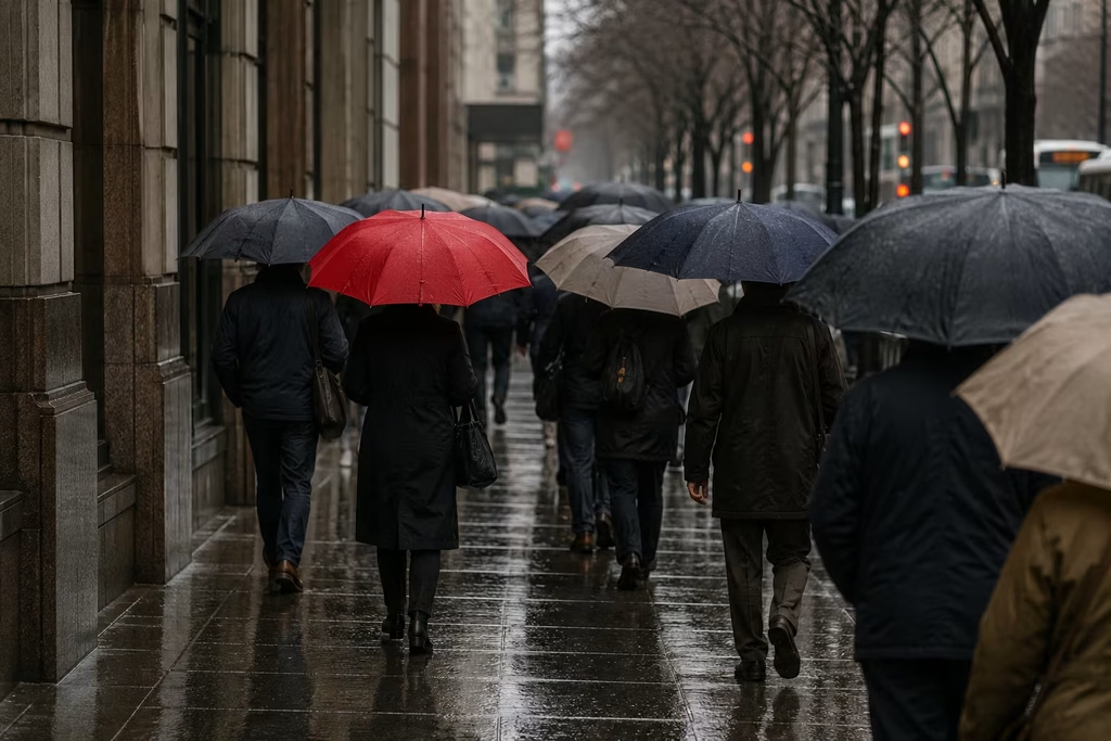
Figure-ground separation
Figure-ground separation is the relationship between the subject and its background. A subject reads clearly when its outline, tone, color, or depth differs from what sits behind it. Poor separation can merge a face with a tree trunk, blend a dark jacket into a shadow, or make an object disappear into a pattern.
The fastest fix is often to move your feet. Shift left or right until the subject sits against a simpler area. You can also change your height, ask the subject to move, or wait for a background element to pass. A small change in position may separate the subject without changing the subject’s expression.
Contrast helps, but it does not have to be extreme. A warm subject against a cool background may separate through color even when brightness is similar. A sharp subject against a soft background separates through detail. Backlighting can create a strong silhouette, provided the outline is recognizable.
Depth of field is useful, but blurring the background should not become an automatic response. A busy blur is still busy. A cleaner background at moderate aperture often gives a more believable sense of place than an extremely shallow focus that removes every clue.
Foreground, middle ground, and background
A photograph can feel flat when every important form sits on the same visual plane. Including foreground, middle ground, and background creates depth and gives the viewer a route into the scene. A nearby branch, a person in the middle distance, and mountains beyond can build a layered landscape. In a street photograph, a close passerby, a central subject, and distant architecture can create a sense of lived space.
Layering does not mean adding objects merely to fill the frame. Each layer should contribute location, scale, rhythm, or meaning. A foreground shape can also partially obscure the subject and make the viewer feel present rather than simply observing from a distance.
Use overlap carefully. Overlap establishes depth, but it can also make separate objects look joined. Check hands, faces, signs, and limbs for confusing intersections. If the layers are too dense, simplify by changing your position or waiting for movement to create separation.
Viewpoint and camera height
Changing viewpoint is one of the most powerful composition tools because it changes the relationships between every object in the frame. Get low and the foreground expands while the subject may feel taller or more imposing. Raise the camera and the ground becomes more visible, which can help with patterns or groups.
Eye-level photographs often feel familiar because they match ordinary experience. That is not a reason to avoid them. Familiar viewpoints can be right for candid portraits and documentary work. The mistake is staying at eye level because it is convenient.
Walk around the subject. Photograph from the side, behind, above, and below. For a portrait, keep the camera at a height that supports the face and the mood. For a building, a low viewpoint can exaggerate height, while a higher viewpoint can reveal the arrangement of streets and roofs.
Phone cameras make viewpoint changes easy, so use the freedom. Do not zoom first. Move closer or farther away and watch how the background changes. Physical movement alters perspective; digital zoom mostly changes the crop.
Cropping and aspect ratio
Cropping is a compositional decision, whether it happens in camera or during editing. The aspect ratio changes how a scene is read. A square frame can support symmetry and centered subjects. A tall frame suits vertical architecture, portraits, and gestures. A wide frame can emphasize travel, landscape, and the relationship between a person and a place.
Avoid cropping at joints when a portrait crop makes the body look accidentally cut. Cropping slightly above or below an elbow, knee, or wrist usually feels more natural than cutting directly through it. Pay attention to hands and feet, since they often carry the sense of a person’s posture.
A crop can change the story. Removing the empty room around a seated person can turn a scene about solitude into a study of expression. Keeping the room may reveal why the person is there. Before cropping, ask what information is being removed and whether that removal is worth the tighter design.
Shoot with the final use in mind, but do not make the image so specialized that it cannot survive another format. If you need a vertical social crop from a horizontal original, place the main subject where both versions can work, or make separate frames intentionally.
The edges matter
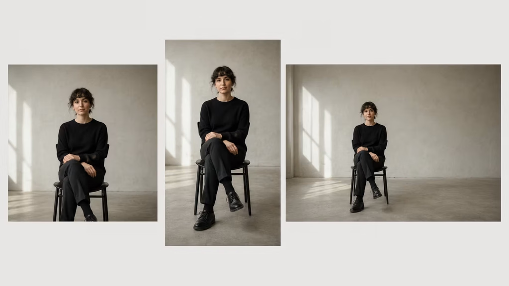
The frame edges are where composition often fails. Viewers may not consciously name the problem, but they notice a bright sliver, a cut-off object, or an awkward tangent. A tangent occurs when two forms touch or nearly touch in a way that confuses their relationship. A head touching the top edge can feel cramped. A line entering from the corner can dominate more than expected.
Train yourself to inspect the edges before pressing the shutter. Look for objects that are barely included. Either include them fully and give them a role, or remove them by changing position or focal length. Half an object at the edge usually reads as an accident unless the crop is clearly deliberate.
Edges can also create tension. A subject partly leaving the frame may suggest motion. A hand entering from outside can make the scene feel observed in the middle of an event. These choices work when the viewer understands that the partial inclusion is intentional.
Light as a compositional tool
Composition is not only about geometry. Light organizes attention through brightness, shadow, color, and contrast. The brightest area often attracts the eye first, even when it is not the subject. Before making a frame, look for where the light is strongest and decide whether that area deserves the attention.
Side light can divide a scene into planes and reveal texture. Backlight can simplify a subject into a silhouette or create a glowing edge. Soft overcast light reduces contrast and can make color and gesture more important. Hard midday light creates sharp shapes and deep shadows, which may suit graphic compositions.
Use exposure to support the structure. A bright sky behind a dark subject can be a distraction if you want detail in the subject, but it can work for a silhouette. A face near a window may become the natural anchor when the rest of the room falls into shadow. Metering and exposure compensation are composition tools because they decide which tones remain visible.
Color, contrast, and visual hierarchy
Color can organize a frame before the viewer understands the subject. A single warm color in a cool scene draws attention. Complementary colors create separation. Similar colors create cohesion and can make a complex scene feel quieter.
Saturation is not the only source of color weight. A small area of highly saturated color can outweigh a large area of muted color. Red often demands attention, but the effect depends on surrounding colors and brightness. A pale blue shape can dominate a dark frame because it is much lighter.
Build a hierarchy. Decide what should be noticed first, second, and third. If everything has equal contrast and saturation, the frame may feel noisy. You can reduce attention on secondary areas by changing your position, waiting for softer light, or adjusting contrast in editing.
Black and white is useful as a test even when you intend to keep color. If the image still works without color, its structure is probably strong. If it collapses, that may be fine, but know that color is doing the main compositional work.
Motion, timing, and gesture
Composition changes from moment to moment when subjects move. A runner needs space in front of the body. A cyclist can appear stopped if the frame cuts off the direction of travel. A hand gesture may create a line that strengthens the subject’s expression.
Anticipate rather than react. Watch the path, choose the background, and pre-compose the frame before the decisive moment. Burst mode can help, but a large number of frames does not replace timing. Look for the instant when posture, gesture, and background align.
Motion blur is also a compositional choice. A blurred figure crossing a sharp architectural frame can add energy and contrast. Panning can stretch the background into directional color. A static subject with blurred surroundings may feel isolated from time. Use blur where it supports the photograph, not simply because the shutter speed was too slow.
A practical workflow in the field
Start by naming the subject in one sentence. If you cannot say what drew you to the scene, spend another minute looking. The answer does not need to be profound. It might be the way a coat matches a wall, the distance between two people, or the rhythm of shadows on steps.
Next, make a loose frame. Do not commit immediately to the first angle. Check the edges and background. Move a few steps in each direction. Change height. Decide whether the surroundings are part of the subject or merely clutter.
Then choose a structural approach. Try the thirds, center the subject, or look for a line. If none of those fits, simplify. Remove elements until the main relationship becomes clear. This is often faster than adding more visual information.
Make three variations. Change one decision at a time: distance, viewpoint, subject placement, or amount of empty space. Reviewing variations teaches more than taking one carefully considered frame and moving on. You will see which change actually affected the image.
Finally, wait. Light shifts, people move, and distracting elements pass. Many compositions are almost right before timing finishes them. Patience is part of composition, especially in street, landscape, and wildlife photography.
How to practice without getting stuck in rules
Give yourself a single constraint for a walk. Use only centered compositions. Then make a set using only negative space. Photograph repeated patterns and wait for one interruption. Work from one fixed spot and compose with movement rather than changing location. Constraints make you notice choices that normally happen too quickly.
Review your photographs at a larger size. Mark where your eye lands first, then where it goes next. If the path feels unclear, ask why. Is there a brighter object? Is the subject too close to the edge? Does a line lead out of the frame? Does the background have more detail than the subject?
Do not judge every image by whether it is attractive. A tense, crowded, or unbalanced frame may be successful if it creates that feeling on purpose. Judge whether the visual decisions match the intended experience.
It also helps to study photographs without copying their surface style. Hide the caption and ask what holds the frame together. Trace the main lines. Identify the largest light and dark shapes. Notice how much space the subject has and what is happening near the edges. Then try to recreate the structure with a different subject in your own environment.
When to break the rules
Break a rule when the rule interferes with the meaning. Center a subject when directness matters. Put the subject close to the edge when you want pressure or uncertainty. Cut off part of a body when the crop makes the gesture stronger. Tilt the camera when instability is part of the scene.
The important distinction is between a deliberate exception and an unexamined mistake. You do not need to announce the reason to the viewer, but you should be able to explain it to yourself. If you are unsure, make a conventional version and an unconventional version. Comparing them will reveal whether the break added anything.
Rules are most valuable when they become invisible. You learn the thirds so you can recognize useful off-center balance. You study leading lines so you can notice the direction of a gaze or shadow. You practice symmetry so you can decide when a small flaw should remain. Eventually the frame feels less like a checklist and more like a field of relationships.
A final checklist
Before you press the shutter, take a quick look at the following:
- What is the photograph about?
- Where will the eye land first?
- Is the subject separated from the background?
- Are the edges clean or intentionally tense?
- Does the empty space give the subject room to act or look?
- Is the horizon level when it should be?
- Do lines support the subject or pull away from it?
- Is the visual weight balanced, or is the imbalance deliberate?
- Would a different viewpoint simplify the frame?
- Is this the right moment, or should you wait?
You will not answer every question every time. In a fast-moving scene, one glance at the edges may be all you get. In a landscape, you may have several minutes to work through every option. The checklist is there to sharpen attention, not to slow every photograph into a technical exercise.
Strong composition does not require a rare location or expensive equipment. It requires noticing relationships: a person and the space ahead, a bright shape and a dark mass, a line and its destination, a pattern and the one thing that interrupts it. Once you start seeing those relationships, ordinary places become full of decisions. The camera simply gives you a way to keep one of them.
Continue reading
Further insights from the Journal



Have a story in mind?
Bring your next project into focus.
Tell us what you are creating and what you want the audience to feel.